Los Angeles Dept of Building & Safety
- Stakeholder & user interviews
- Content inventory & sitemaps
- Information architecture
- Taxonomy
- CMS design & development
- Front-end development
- Google Analytics
- Web & PDF accessibility
- Workflows for applications
The brief
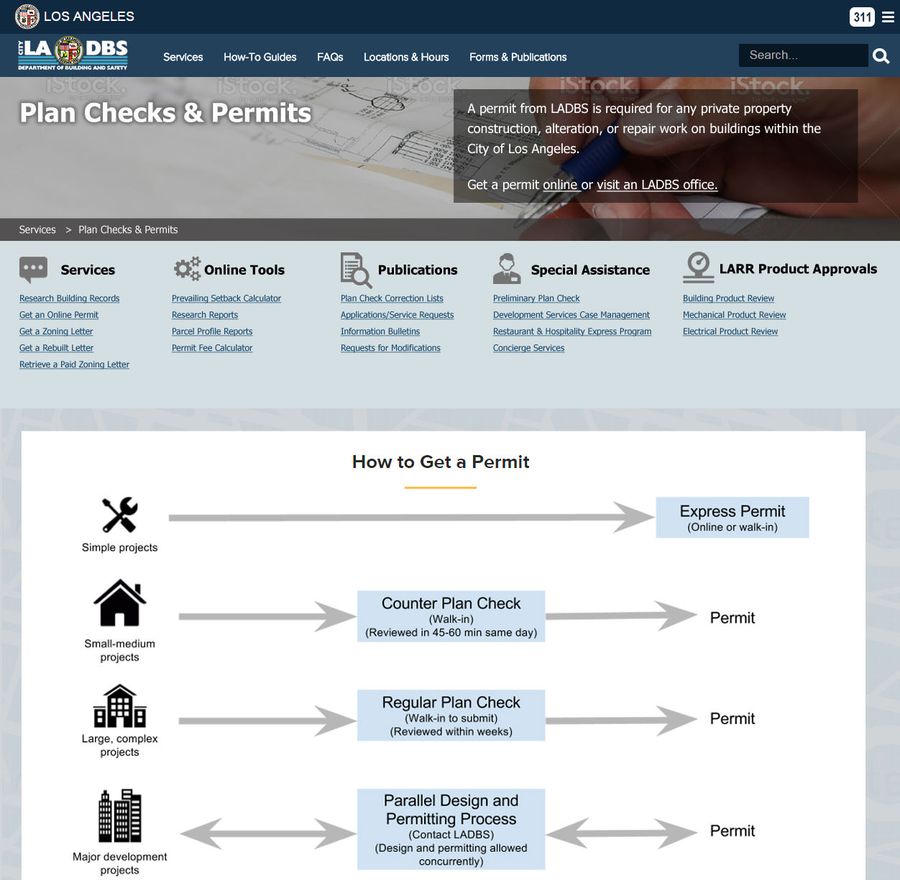
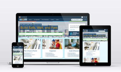
The Los Angeles Dept of Building and Safety’s 15-year-old website at LADBS.org was no longer serving the needs of on-the-go site visitors looking to be informed. The site did not indicate details of department services, and was not responsive on mobile phones. Increased expectations from executives about attracting developers to the city also prompted a redesign.
They sought improved findability with a more modern, business-oriented brand.
My role
I was hired to organize content as an information architect, then took on the roles of product manager, UX designer, and front-end developer.
What I did
Interviews
To see where the current website was serving user needs, I met with customer-facing employees at the permitting counter and the concierge desk. I also had conversations with contractors and architects. I learned that:
- The site did not have information for customers unfamiliar with the permitting process. That would result in unnecessary visits to the department, wasting time and money.
- People familiar with the construction process did not use the site extensively. They would only refer to a specific set of documents, or bypass the content to go right to our online services.
It was clear that with the re-organization of existing content, we also needed to add information so customers could answer the question, “Do I need to come to an LADBS office, and if I do, what do I need to know or bring?” At the same time, we also needed to have shortcuts for customers already working in construction.
Information architecture
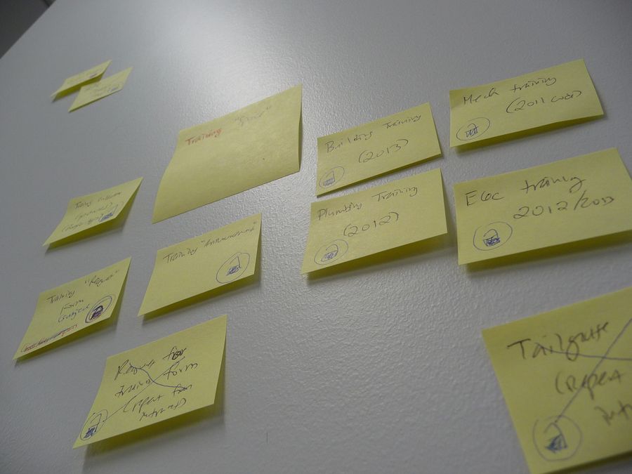
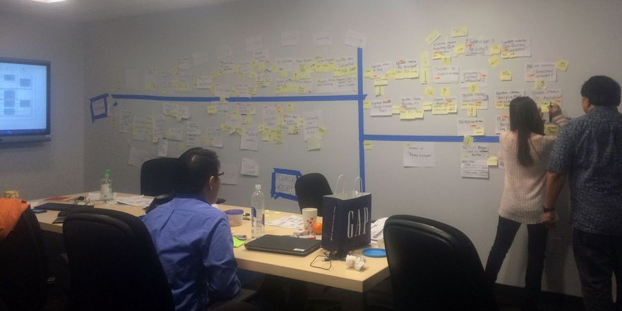
I did a top-to-bottom inventory of existing content, and added pages where there were gaps in information. It resulted in a sitemap of 200 pages.
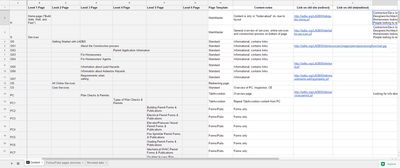
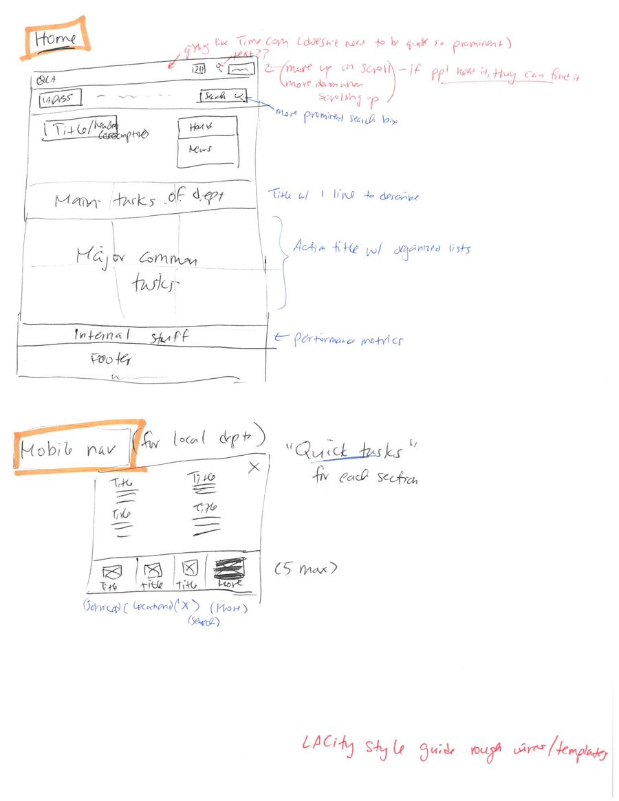
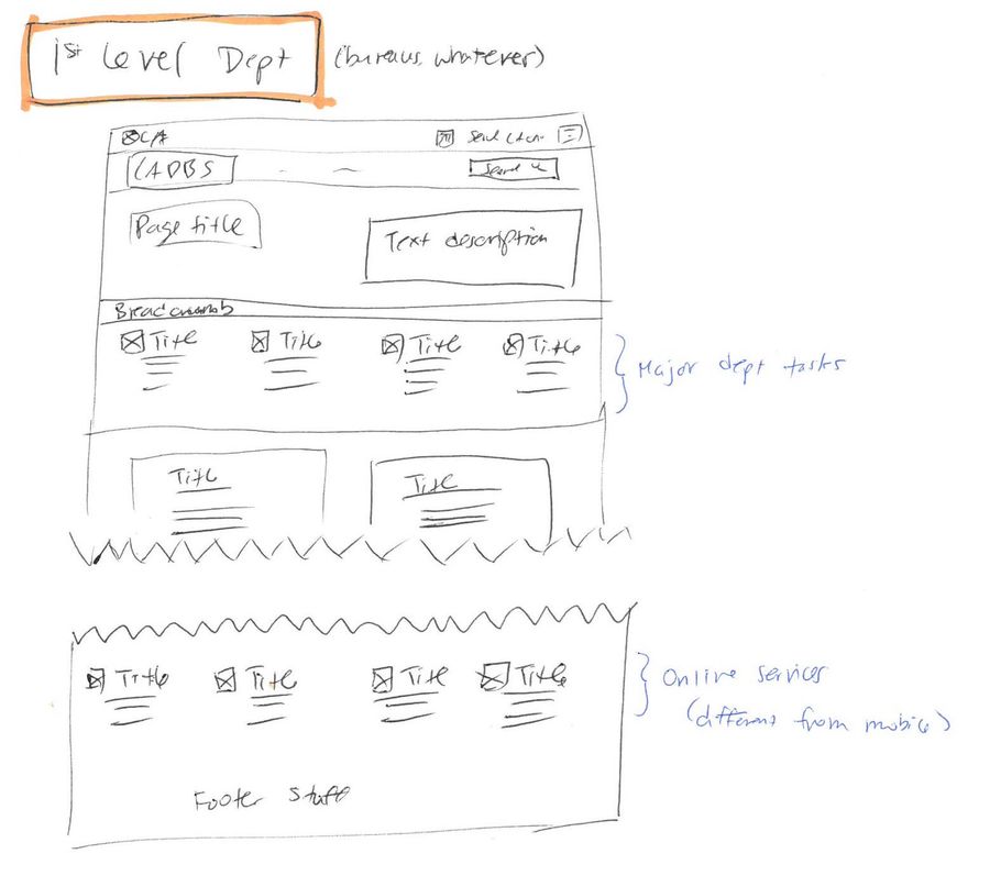
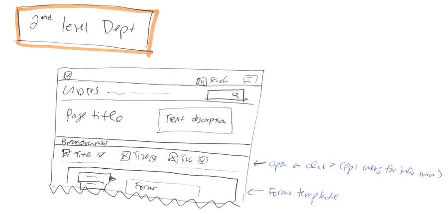
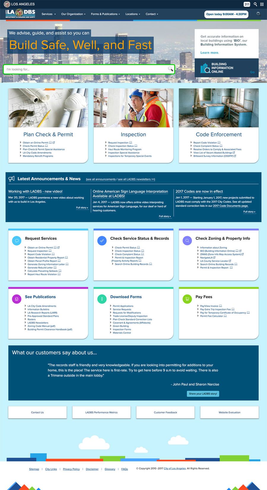
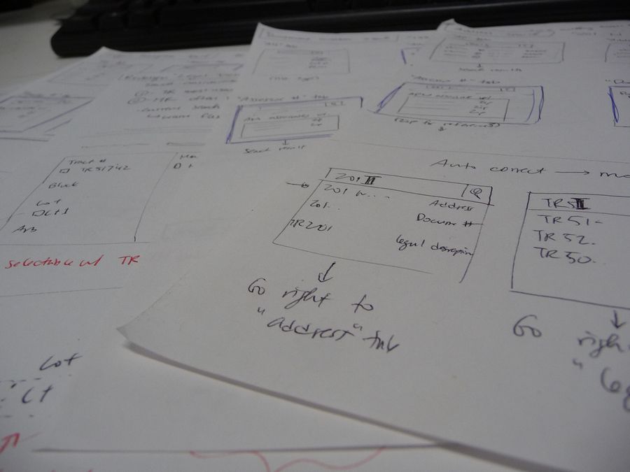
Reorganizing content also required a redesign of page layout. I sketched out rough wireframes for the homepage, then first and second level department pages.
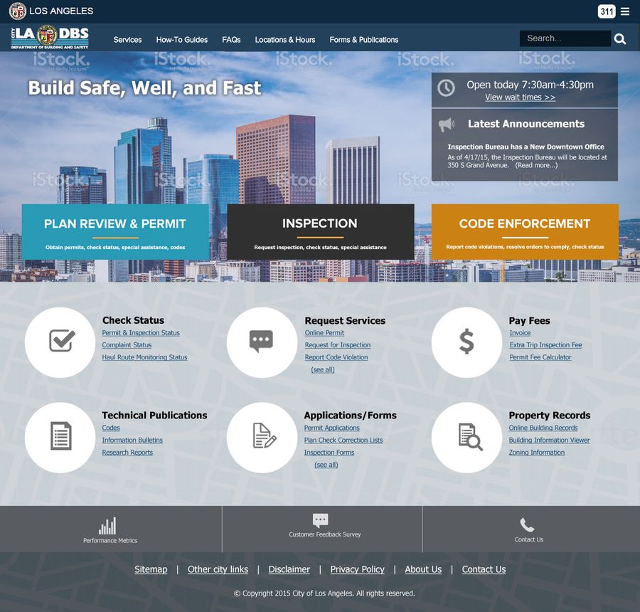
I presented the following mockups to executives to finalize layout, and then brought on a visual designer to help with branding.
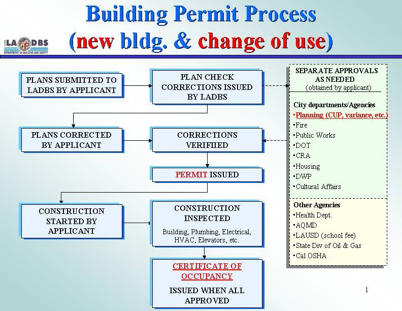
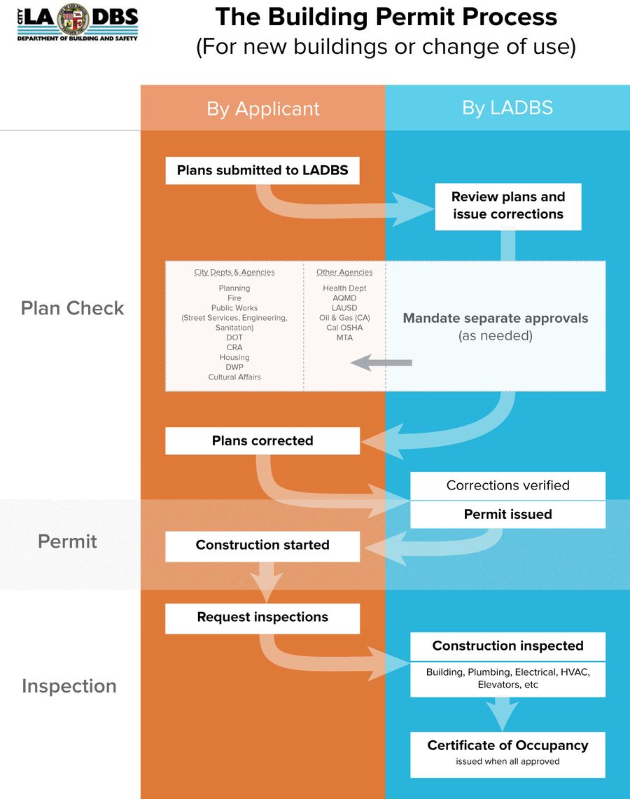
To help customers immediately, I also redesigned the permitting process flowchart, indicating where responsibility passed between the customer and LADBS. The helpdesk staff began spontaneously referring to it right away.
Taxonomy
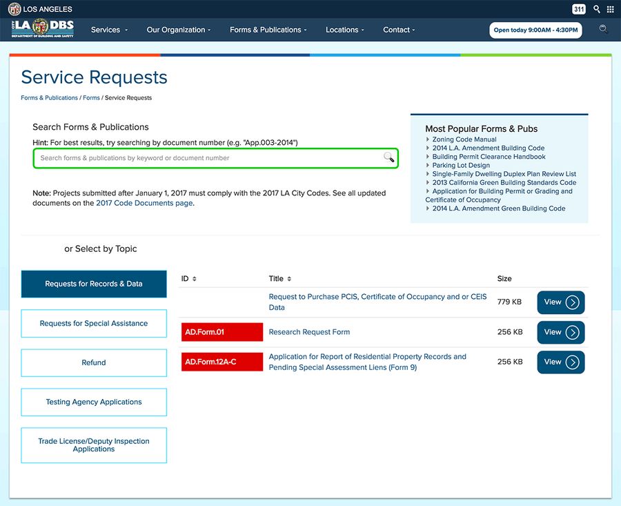
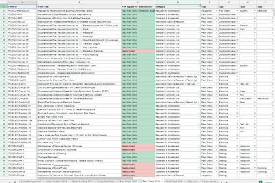
To help with customer needs, we needed to present our 1000 documents in various categories in multiple areas in the website. To leverage reusable content with our CMS, I devised a taxonomy for all of our forms and publications.
Development
At this point, we needed to maintain increased expectations with empowered website editors. I took on a complete overhaul of the CMS, becoming the in-house expert after taking over from outside vendors. I minimized the number of custom-coded page templates and widgets, leveraging existing CMS features for ease of maintenance for both developers and non-developers.
In addition to the CMS development, I was responsible for front-end development, adding:
- Fully responsive design for desktop, tablet, and phone
- Special information for printed views
- Google Analytics event tracking, for documents and online services
- Automated daily Google Analytics reports emailed to management
I also worked with back-end developers on:
- Live wait time widgets for each office
- Automatic holiday closure announcements
Accessibility
Given that LADBS is a government entity, we also needed to comply with Section 508 accessibility standards. I worked with the Department on Disability to standardize and document PDF accessibility processes.
We also worked with the Mayor’s Office to adopt web accessibility using SiteImprove.
Results
We launched the new website 10 months after I came on, and 6 months after I took over development. Findability improved by 30%, and usage increased by 20%.
Other department work
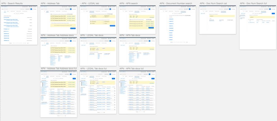
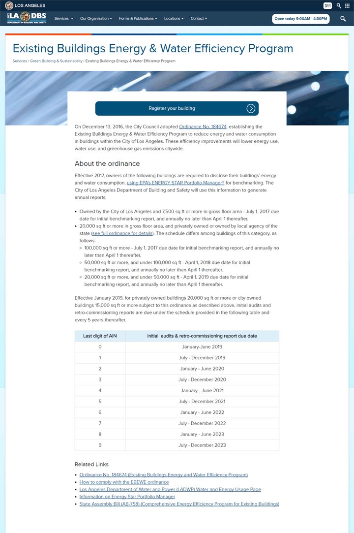
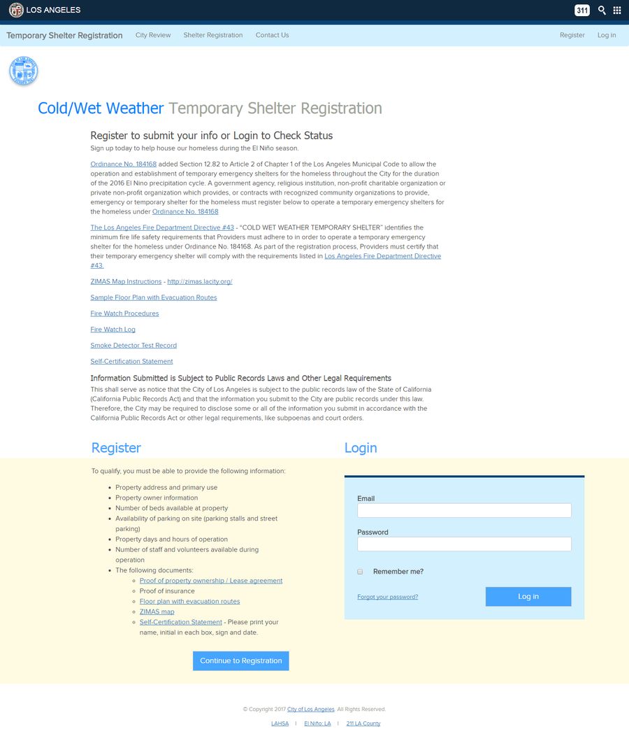
After launching the site, I then worked on workflows for other applications, developing the front-end as needed.

