San Francisco affordable housing programs
- Stakeholder and user interviews
- Content inventory and audit
- Information architecture
- Content strategy and pair writing
- Front-end for existing website templates
- Website editor workflows
- Training in website authoring and writing
The brief
The San Francisco Mayor’s Office of Housing and Community Development (MOHCD) had recently launched an online application for below-market-rate rentals at housing.sfgov.org, to much success. MOHCD wanted to have the same ease of use with its multiple homeownership programs. However, buying a home through an affordable program involves more requirements, more paperwork, and more touchpoints compared to renting.
Building up the technical capacity to add the homeownership listings to their online application would take years. So, they sought to rewrite informational content on their department website as a stopgap.
My role
I was hired as a Team-of-One content strategist/UX designer, then took on the role of front-end developer.
What I did
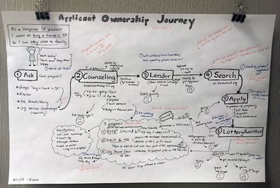
Stakeholder interviews for user journey maps
To get an accurate view of the current program landscape, I met with all the housing program managers to walk through the touchpoints of each program. I then illustrated each of the programs as a user journey map, and pinned them to the outside of my cubicle. They became a reference for anyone working with MOHCD programs, to understand how it all works.
User interviews
From contacts in the housing programs as well as collecting names from public housing lotteries, I talked to real homeownership program applicants about their experience. I also used previous research done on the online rental application. I discovered that huge pain points included:
- Confusion about the process, since each program has slightly different eligibility criteria and requirements
- Feeling lost and stressed, considering how long the process was and how it almost always involved finances and paperwork
One main theme emerged: “Trustworthy information empowers.” I aimed to provide as much timely and relevant information as possible, to empower applicants and earn their trust.
Content inventory and audit
To find information gaps, I did a content inventory of the current site, from automated means as well as manually clicking around. (It’s surprising what you can find just clicking around, especially on the back-end!) I ended up with 290 content pages.
I then did an audit, gauging each page’s content owner, user need, goal, and reading level. I also standardized pages by user need and goal, designing templates to improve consistency. I proposed combining pages with overlapping goals and deleting outdated pages, reducing the count by 22%.
Project recommendations for executive stakeholders
I presented findings from user research and my content audit to executive stakeholders, to unanimous approval.
Recommendations included:
- Focusing on tasks and services instead of categorizing by audience or program. This would entail major changes to site navigation and creating how-to guides
- Uniting information instead of putting details into silos. This would mean increasing collaboration between website editors, and creating a content style guide.
- Promoting community engagement instead of being a passive source of information. This would entail integrating information and resources across the department, as well as between other departments like the Mayor's Office.
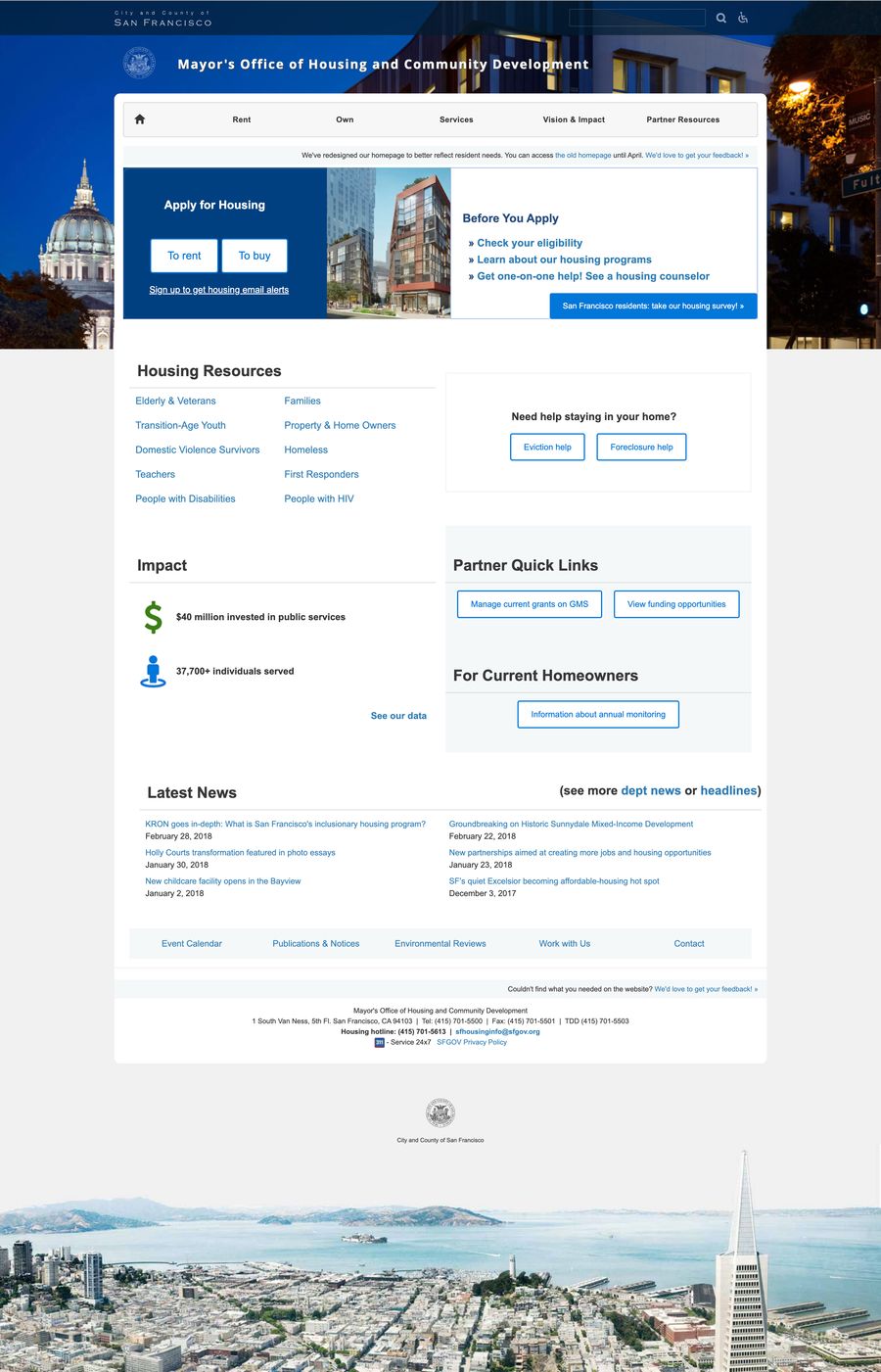
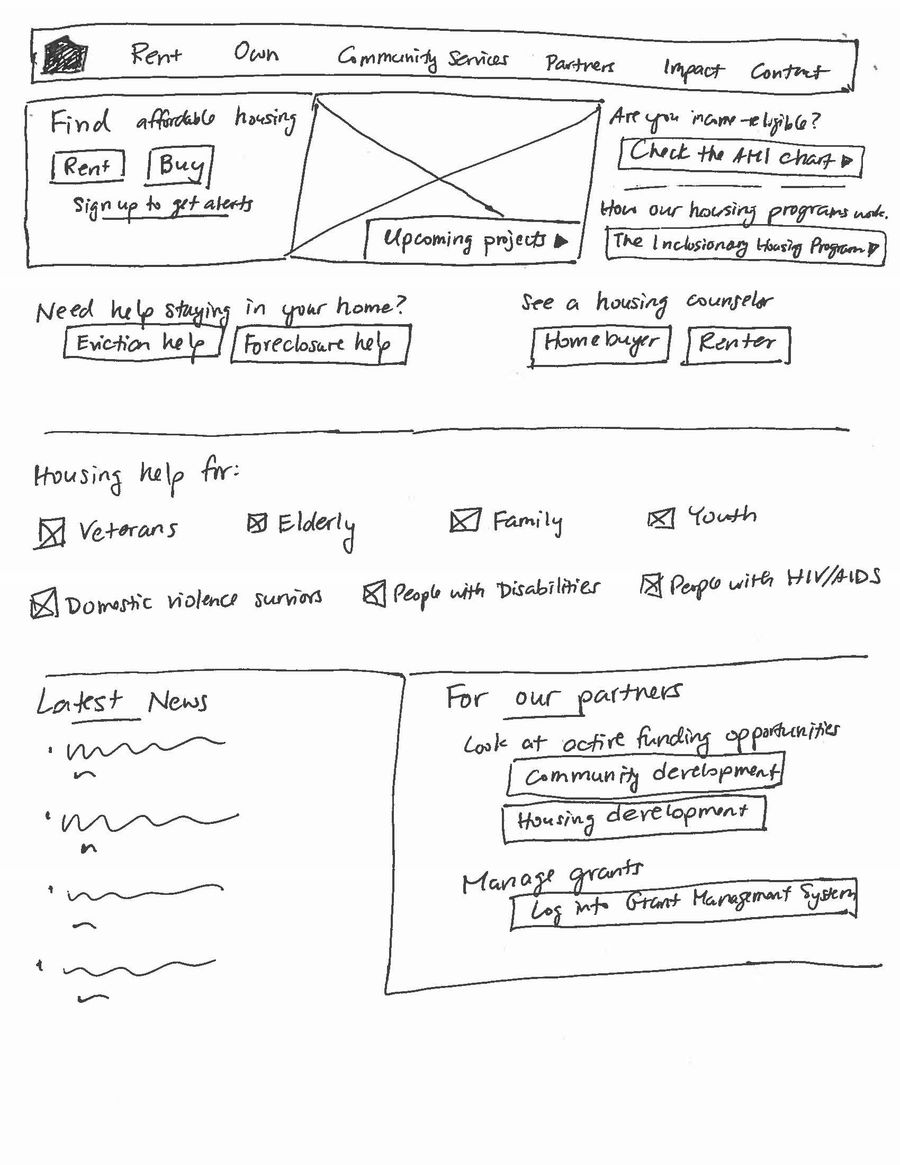
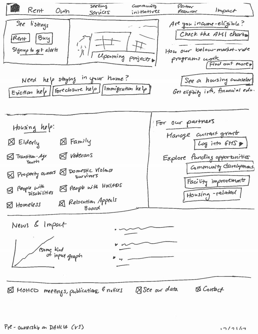
Redesigned homepage
To align stakeholders on priorities, I sketched out several versions of the homepage to present. Seeing the options helped facilitate the conversation around how to prioritize department updates, housing partners, and populations. (After housing applicants, of course!)

Pair writing informational content
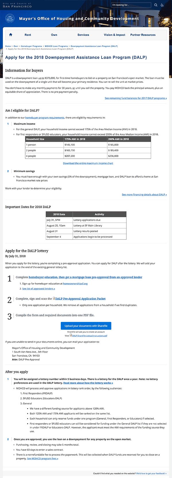
I worked closely with homeownership program staff to rewrite informational website content. I created process overviews and added context on each page, so applicants would always know what to expect. This improved readability of new pages by 5 grade levels—Grade 12 to Grade 7.
Read more about one example of a rewritten program.
Front-end customization
I worked with the existing website templates in Drupal, integrating styles from the rental application to make the visual experience more consistent. (Also ended up working with future engineering colleagues at SF Digital Services!)
Supporting department outreach
Being a designer with front-end skills meant that I was also involved in separate initiatives that were high visibility for the department.
Examples include:
- Advocating for MOHCD’s interests while working with designers and engineers from ShelterTech on SF Service Guide.
- Launching a landing page with department executives under a tight deadline for UnlockSF, a cross-channel campaign involving billboards and bus ads throughout the Bay Area.
- Working regularly with communications staff to streamline publishing outreach initiatives with the Mayor's Office.
- Supporting MOHCD staff participating in mini-hackathon events like Civic Bridge Day of Service (2019) and SMALLIFY Rapid Innovation Lab (2018).
Helping the helpers
Given that I am only one person, I’m always looking for ways to integrate better processes and scale my impact.
Ways that I empowered others:
- Trained program staff on content design and plain language writing, 1-on-1 as well as leading workshops
- Created cross-application templates (Microsoft Word to Drupal) for program staff to use for the website, ensuring mobile usability when publishing program-critical information
- Developed a reusable template system for email alerts, to accommodate 14 different types of housing and funding opportunities. Trained program staff to send housing email alerts to 95,000 recipients seeking affordable rental and ownership housing opportunities. I also conducted A/B test for email subject lines in housing opportunity email alerts, to maximize open and click-through rates.
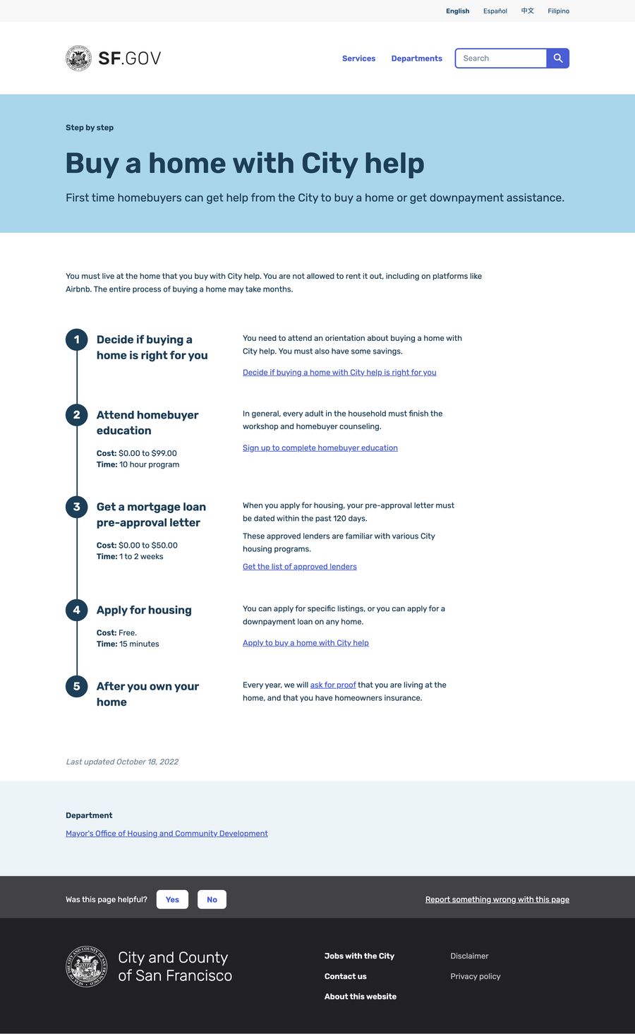
Moving MOHCD to SF.gov
After transferring to the SF Digital Services team, I helped MOHCD move its services pages (and homepage, goodbye my work!) to SF.gov. This involved consolidating my SFMOHCD.org pages into a homebuying “step by step” on SF.gov.
I also supported the housing.sfgov.org team there with content expertise, as they integrated the homeownership programs and leasing agent processes.
Results
After launching the new homepage and navigation menus, the website’s findability improved by 25%, calculated through pages per session.
As a result of the rewritten webpages, the number of applicants for a downpayment loan program increased 35% from the previous year. Read more about the downpayment project.