
LiveWell San Diego hackathon website
- User flow
- Content inventory
- Wireframes
- Copywriting
- HTML/CSS (Twitter Bootstrap)
- Git version control
- Graphic design
- Discussions about data communication
Introduction
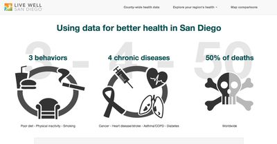
Over 50% of all deaths in the US can be attributed to 3 behaviors that result in 4 chronic diseases. This is known as the “3-4-50” concept.
The aim of the hackathon was to build a website communicating the connection between these behaviors and the diseases they cause, on a local level. The more knowledgeable the population, the more engaged they can be in improving their own health.
What I did
User research
At the hackathon, I had conversations with a few spectators about what they would want to see from a website like this. For a health data website, they would want to know what they, as individual citizens, could do to improve their own health.
I hammered out a user flow with the spectators, focusing on the main questions they would have while going through the website.
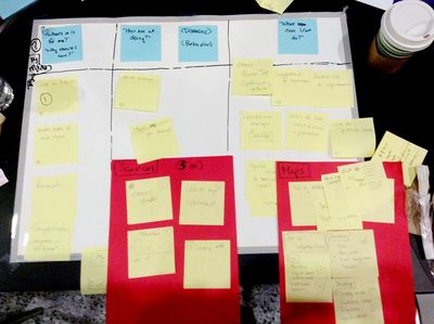
Content strategy
At the hackathon, we were given a large data set, which included demographic census data and health data, sorted by subregional areas in San Diego County.
In aiming to make the issue as local as possible for both policymakers and civilians, we also looked up health-related locations such as grocery stores, liquor stores, parks, farmers markets, etc.
We concentrated on leading regular people on a story of what the data meant, making it easy to look up how their neighborhood was doing on a number of health outcomes. In addition, we would show them how those outcomes were potentially connected to local factors, such as number of grocery stores and liquor stores.
User experience
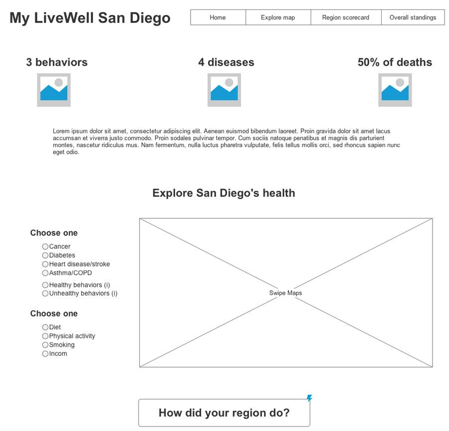
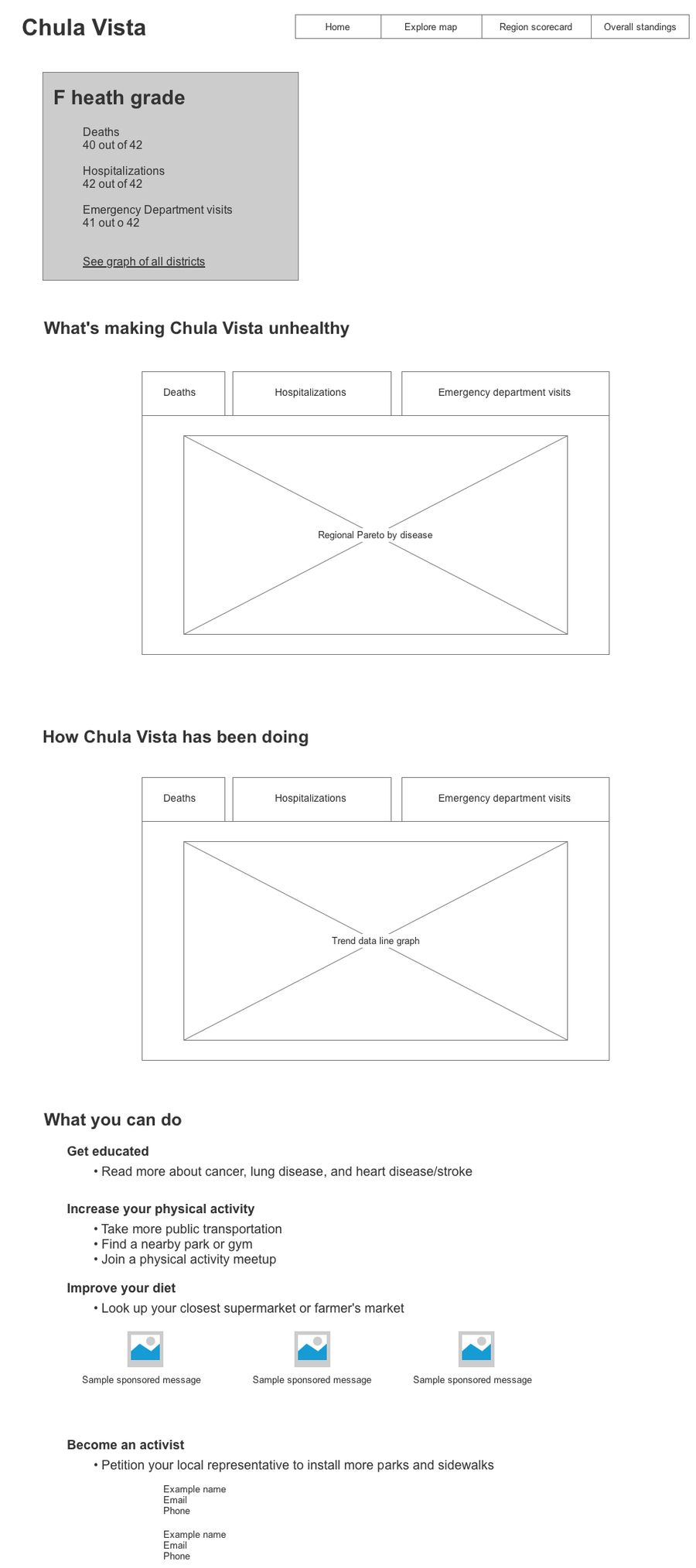
In order to make sure we were all on the same page before jumping into Esri story maps and coding, I produced a few key wireframes.
Visual design
Instead of hoisting a bunch of text onto the user explaining the concept of the website, I made a series of icons in Illustrator to make the introduction engaging and easy to understand.
The developer (Andrew Akagawa) and I used Git and Twitter Bootstrap to build the website together, with me focusing on CSS and him focusing on data visualization using Google Charts. Healthcare data specialist Diana Gesshel (as usual) was our data queen, collecting and organizing the local data to display on our map.
Final result
We debuted our prototype, and received 3rd place in the Harnessing Local Data to Help Prevent Four Major Diseases in San Diego County” Code-A-Thon sponsored by Health 2.0.