
Interlucent hospital price transparency app
- User journeys
- Personas
- User flow
- Content inventory
- Wireframes
- Copywriting
- Endless discussions about strategy and data communication
The brief
A major issue in the current healthcare landscape is hospital price transparency. People don’t know the true costs of procedures when they go to the hospital.
Providers simply set the prices they want. Even worse, quality doesn’t always correlate with cost! The aim of this app challenge was to make it easy to research prices of medical procedures and to find the best hospitals in a specific area. The result of this would be more knowledgeable consumers who could make more educated decisions about medical procedures.
My role
The team consisted of data geek / healthcare regulation expert Diana Gesshel, and me being the UX designer structuring the information in a way non-healthcare regulation experts could understand.
What I did
User journeys
Before setting out, I made storyboards to illustrate our user journeys.
Patient experience

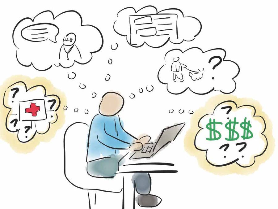
Patients feel:
- Lost and confused
- Overwhelmed and uneducated
- Hopeless and powerless
We can help them feel knowledgeable and in control, in terms of hospital choice and price.
Payer experience
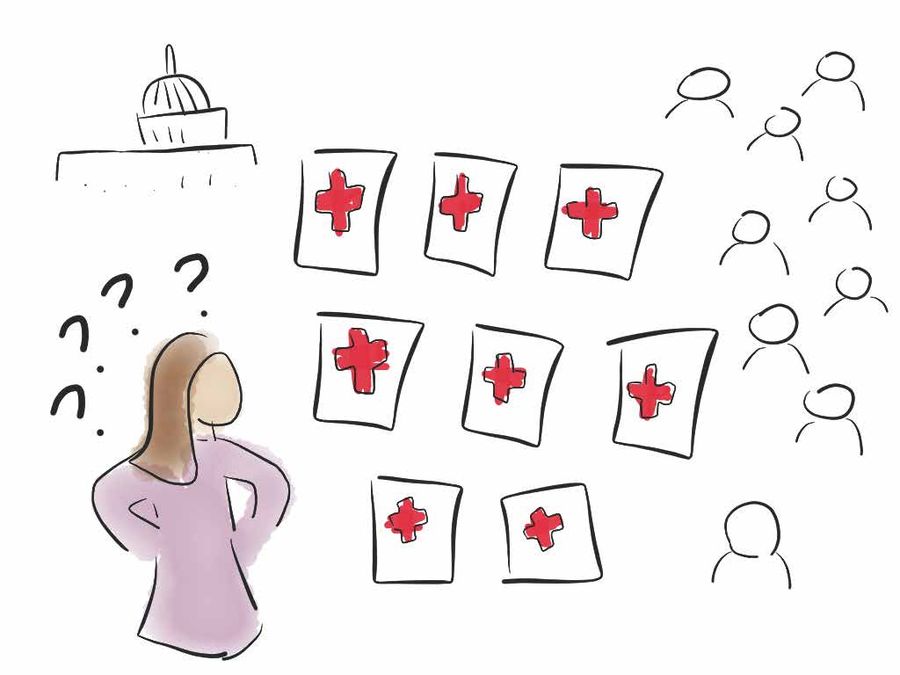
Payers feel in the dark. We can help them feel in control with accessible knowledge.
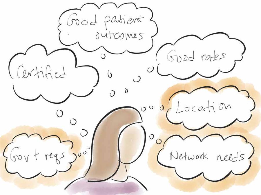
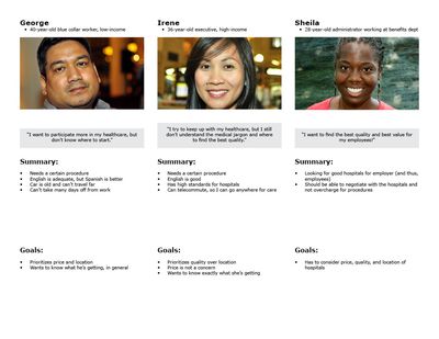
User research and personas
We had several audiences to design for, and I produced 3 basic user personas based on each audience type.
Content strategy
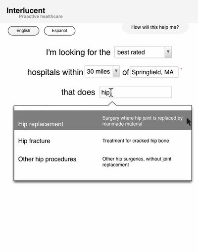
Since most consumers are familiar with location-based searching on Yelp and various travel sites, I emulated their style of search.
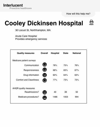
Diana and I hashed out the hospital and procedure information that would be most useful to consumers, within the vast data set provided.
We aimed to be accurate in our reporting, while also being manageable for the typical consumer. Given the amount of data that we had (some inconsistently collected), this was quite a challenge!
Aside: I totally get it now when the New York Times data visualization team says that finding and cleaning up data is “almost half the job!”
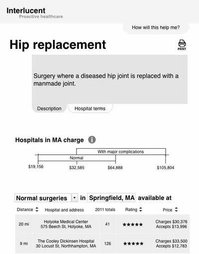
User experience
With our flow and necessary data properly squared away, I started sketching out what the screens would look like, then laid out the screens in more detail in wireframes. My aim was not only to make the app task-focused, but also educational.
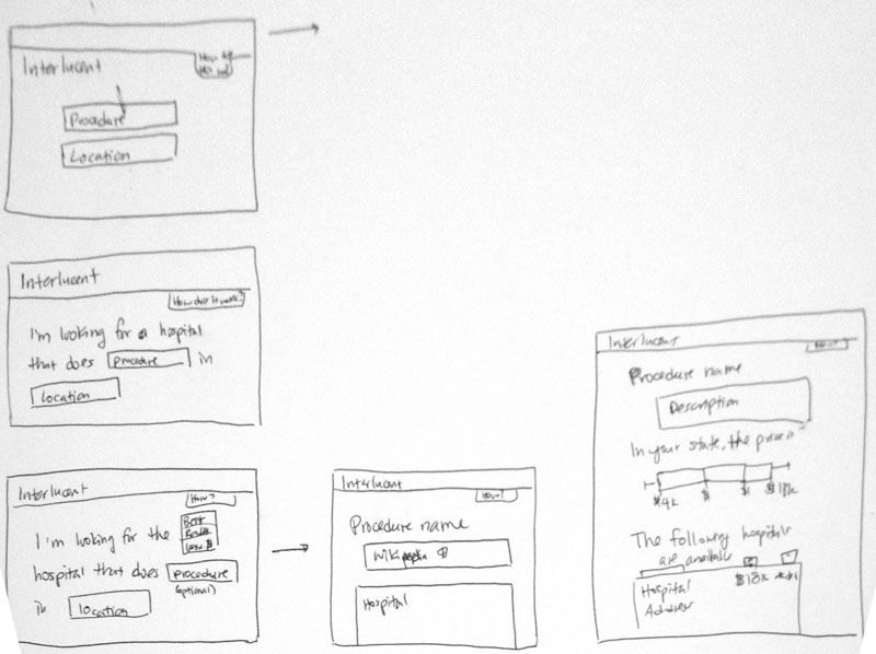

Wireframes
Results
With the wireframes and interactive prototype, we streamlined the information flow to make it more manageable for regular consumers.
Our final submission for the challenge can be seen on Invision.