Life According to DFW book set
- Content strategy
- Layout
- Packaging
Introduction
Although David Foster Wallace is most renowned for his modernist fiction, the essays he wrote for magazines throughout his career are intensely personal, accessible, and his optimism for humanity is evident throughout.
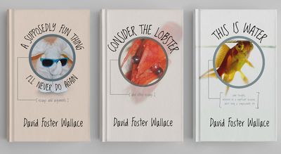
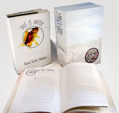
I designed a book set to contain the essay collections published during his lifetime, as well as the only commencement speech he gave. The set was targeted at readers from 20-50, who were already fans of the author.
Content strategy
After reading a number of the essays he wrote, I noted four themes running through them that could be visualized:
-
Clarity in a world of noise
-
Focusing in on a tiny detail in an otherwise mundane existence
-
Floating helplessly while the world churns around you
-
The individual making a decision to fight against the default of a group
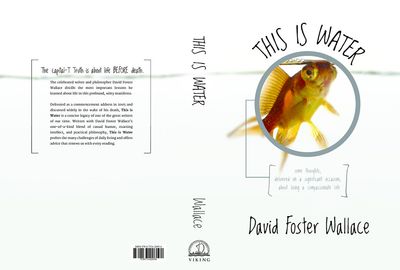
In the end, I combined the first and second themes, determining that Wallace’s writing style is most characterized by his ability to amusingly make light of very small details that others would surely overlook.
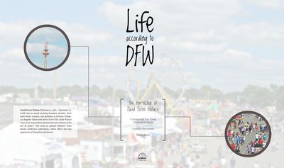
I designed around a theme of magnification for the packaging and layouts, as well as utilizing handwritten typefaces to communicate his personability.
Visual design
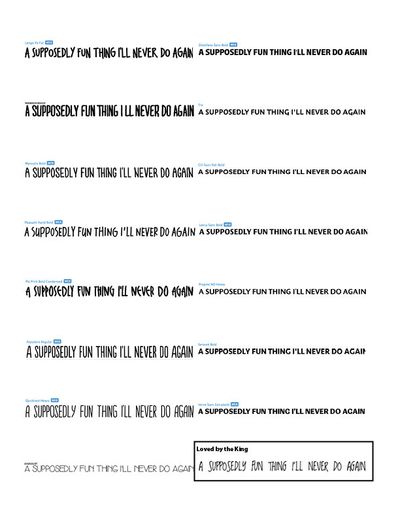
I tested out many handwritten typefaces, aiming to find one that had the right balance of whimsy and introspection.
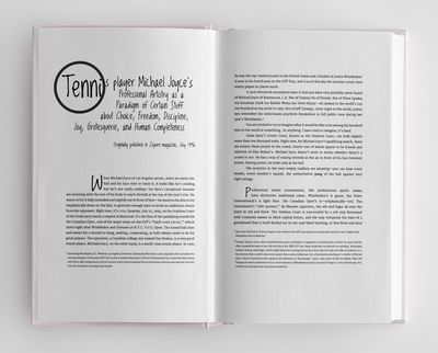
I also brought the magnification theme into the inside of the books themselves, always reminding the reader. No detail was too small to focus on, pun completely intended!
Final design
