
HitRECord workflow redesign
- User research on site, Facebook, Twitter
- Personas
- User testing
- Ethnography
- User interviews
- User flows
- Information architecture
- Tree testing
- Wireframes
- "First click" tests
Introduction
HitRECord.org is an open collaboration production company, combining the online efforts of 350,000 artists around the world to make short films, books, music, and most recently, TV shows.
Given its shifting project type, I sensed a huge opportunity to streamline workflow across the site, to make collaboration easier for the community artists across numerous active projects.
What I did
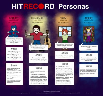
User research and personas
I started on the site itself, cataloguing what 150 members wrote about their relationship to hitRECord, and developed personas from that research.
I later started participating more in the site itself, interviewing members individually, speaking with them about their motivations and reasons for passionately participating on the site.
Strategy
From the extensive user research, I came to the following conclusion:
People come to hitRECord to have a safe space to share their artwork with others, and to make art together. Its strength is in being a safe space for artistic collaboration.
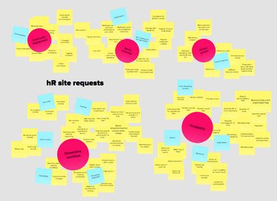
In affinity-diagramming the site features requested onsite, I found that most of the requests centered around improving workflow and findability. In addition, there was interest in direct community engagement, artistic growth, and using the site as a hub for official information.
User testing the existing workflow
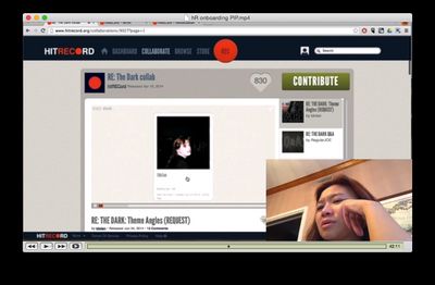
I asked an acquaintance, who had seen “HitRECord on TV” but never been to the site, to do a user test for the current onboarding process. She had a lot of trouble navigating through the different projects and finding something she’d be interested in doing.
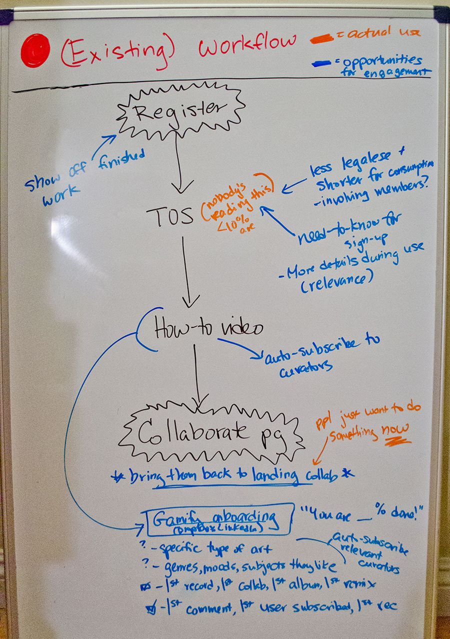
Workflow analysis
I then looked into existing workflows, and documented where I could see opportunities to encourage engagement in the community. Here’s one of the whiteboards:
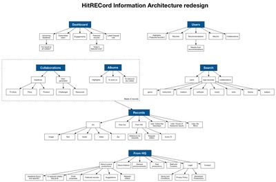
Information architecture
After analyzing how the site was structured, I developed a new site structure. It’s very similar to the current system, except it organizes pages by task as well as by type.
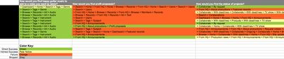
User testing of redesigned workflow
I performed a tree test on the new information architecture with 12 HitRECord members, and gleaned several important design insights from it.
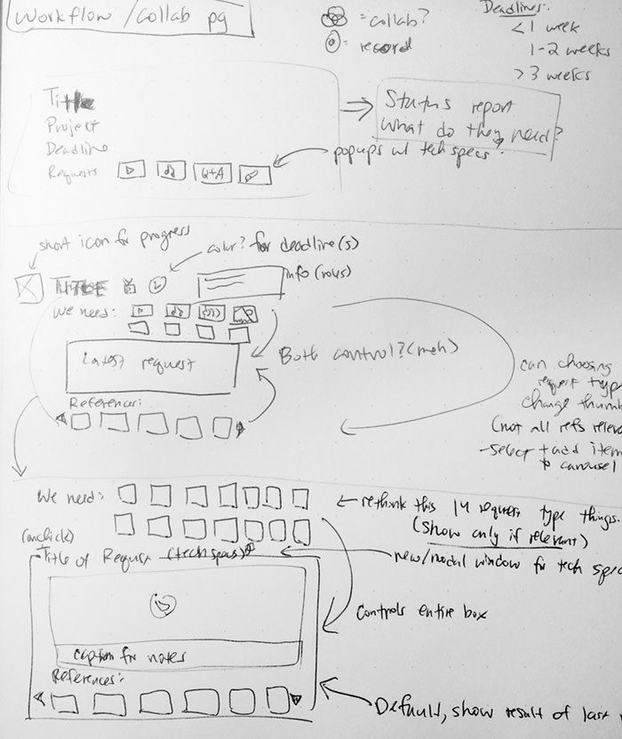
Sketches
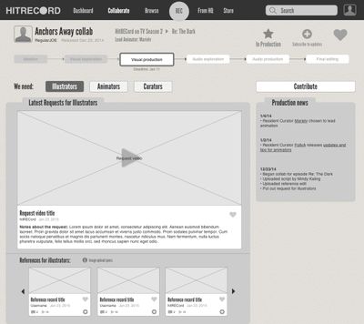
With the structure determined, I sketched a few layouts for 3 key screens that would maximize communication of project information.


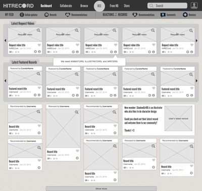
Wireframes, tested successfully for “first click”
I redesigned 3 key screens, and tested them with hitRECord members for specific tasks using “first click” tests. All of the screens performed successfully, above 80% success.
A few reactions from participants:
I loved it. Clear and informative!
Fresh, informative and resourceful.
EXTREMELY ORGANIZED OH MY GOD. Very clean and the interface is much more navigable. The options make it a whole lot welcoming to new artists.
Ideas to improve engagement
The screens above move the project management aspect of the site forward, but more streamlined browsing and communication systems, as well as mobile solutions, have yet to be sketched, wireframed, and tested.
I started ideating ways to encourage more community engagement, one of which is documented here:
