Southern California AP Institute website
- User flows
- Wireframes
- Visual design
- HTML, CSS3
- Tearing my hair out testing Internet Explorer 6 compatibility

The brief
The Southern California AP Institute is a 4-day summer program for high school Advanced Placement teachers, headed by a husband-and-wife teacher duo, Larry and Sheri Calabrese.
The website was in need of a redesign, since it was 10 years old and hadn’t gone through a single layout change since then. In those 10 years, there were many strides in website standards and user experience best practices that they could leverage.
My role
I was both the designer and developer for this project.
What I did
User research
From talking with the Calabreses, I determined that the audience consisted of high school AP teachers teaching a specific subject. They would likely find the website through a search on the College Board’s summer workshop webpage, or from brochures passed out to local high schools.
Content strategy
The audience coming onto the website would already be targeted and have a specific need. The legitimacy of the program would be the most important message to convey for new visitors.
User experience
With a cleaner layout in mind, I set to work in Adobe Fireworks putting together mockups for the Calabreses to look at.
Visual design
Later on, I determined that the original header was far too busy. Instead of inserting multiple small images onto the home page, I chose to feature one that would immediately attract the viewer, in a size that would show it off properly.
The Calabreses were not interested in updating the website themselves, and besides, the teachers email their syllabuses individually, each using their own formatting. Since I would be updating the site myself, I hand-coded the site as static HTML pages.
Final design
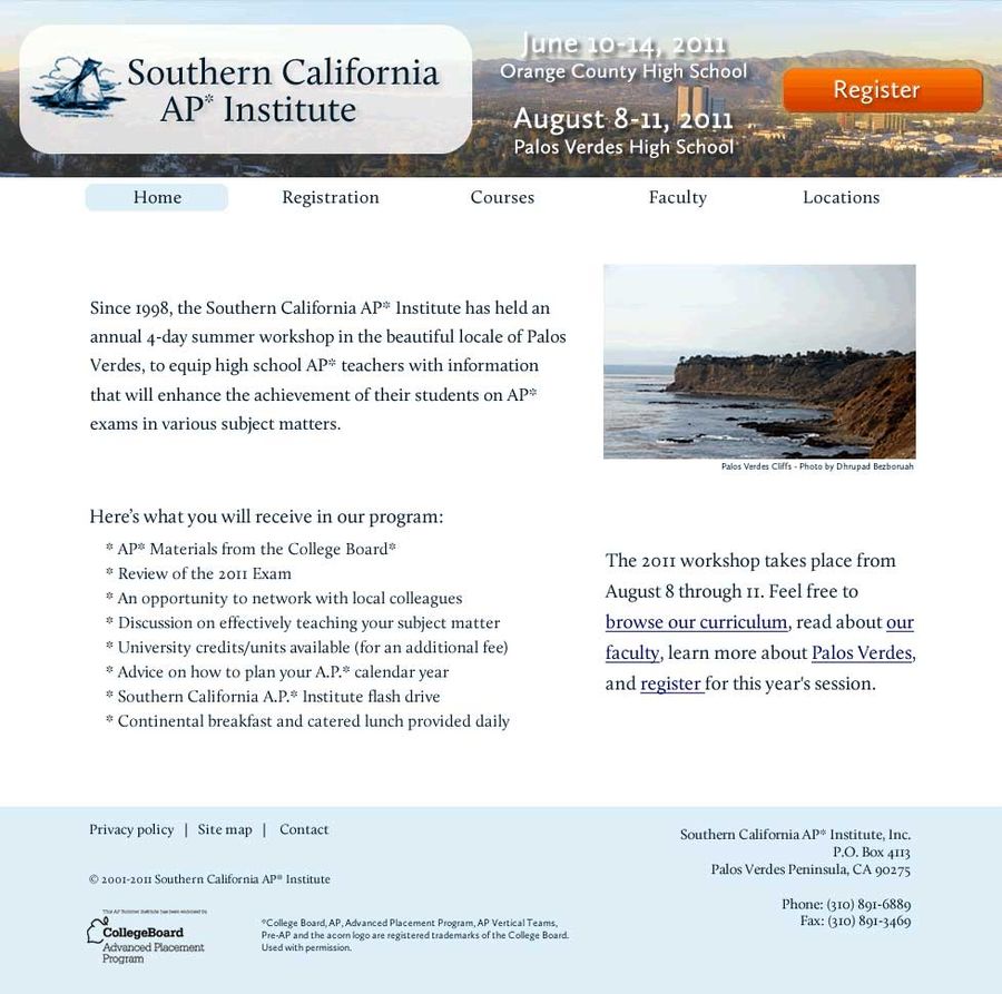
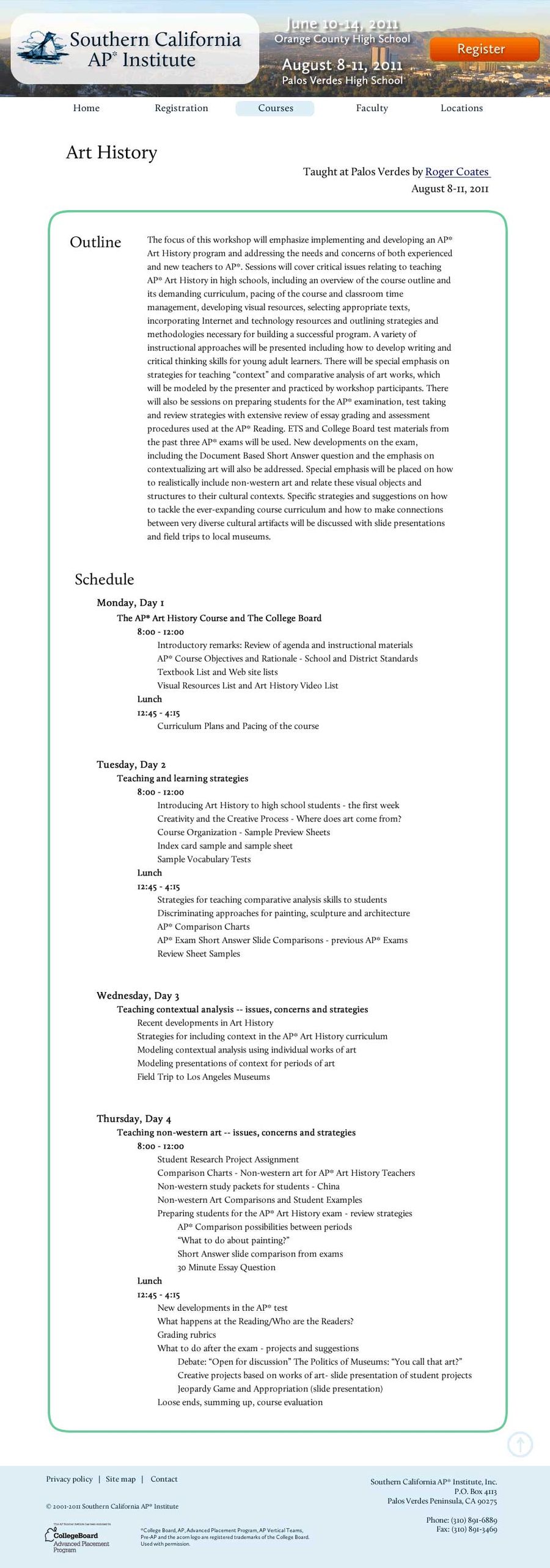
The website can be seen at SCalifAP.org
Results
The redesign was a resounding success. The first year after the new design was implemented, there was a 20% increase in signups from the previous year. They’ve had to open multiple new class sections in subsequent years to accommodate additional demand.
Anita is truly a gifted individual who has a unique talent to display art work and graphics for web page designing. When we hired Anita, our business was fairly small and the layout for the web site was a bit antiquated. During these past few years with Anita at the helm, we have increased our enrollment in our workshop and have had many compliments on how professional the site appeared and we truly value her worth to us.
—Larry Calabrese


