
Flying Eyes Sunglasses website
- Content inventory
- Competitive analysis
- Content strategy
- Information architecture
- Purchase flow
- Site map
- Wireframes
- WordPress customization (Genesis framework, WooCommerce)
- HTML, CSS, jQuery
- Responsive web design

The brief
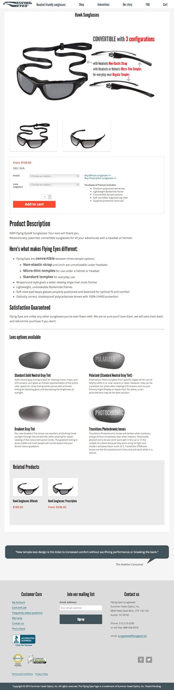
Flying Eyes sunglasses are Summer Hawk Optics’ flagship product, providing comfortable, high-end eyewear for anyone requiring headgear.
They sought a new website to coincide with the introduction of an improved product line. They also wanted a website that was able to grow with the company as it added new products and purchasing capabilities.
My role
My aim was two-pronged: to build a robust new structure to the site for customers to customize their sunglasses, and to also clarify the product’s value proposition.
What I did
Competitive analysis
I looked at websites of top luxury sunglasses sites, to see what the e-commerce standards were.

Learning more about Flying Eyes sunglasses, I also drew inspiration from the design and the adventurous, immersive brand attitude of GoPro. In fact, they had a tagline that could actually work for Flying Eyes: Be a Hero. Though honestly, I think Flying Eyes wearers, which include first responders and surgeons, deserve that moniker more than GoPro users!

Content inventory
I then looked at the content of the existing Flying Eyes site, which had been built to sell only one product with a limited number of lens options. I also discussed future product and workflow plans with the client, to get a better idea of what the structure of the new site should look like.
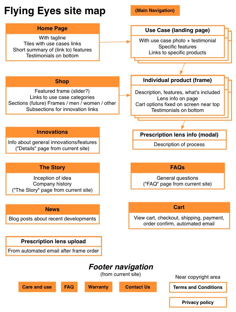
Information architecture
I made two site maps to visualize the architecture – one which displayed proposed page templates, and one that contained specifications to keep track of the information per page.

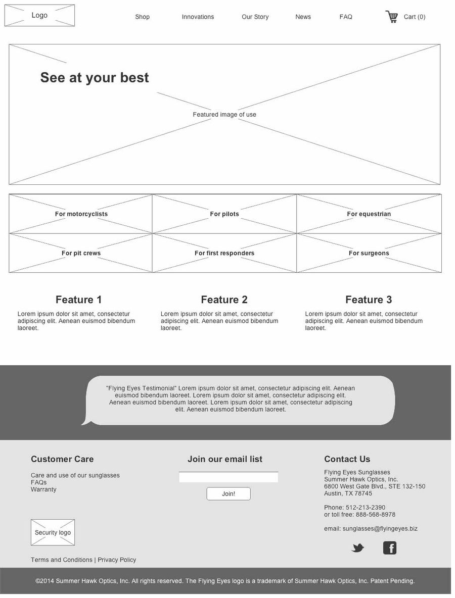
Wireframes
With the information organized, I made wireframes of the main page templates. My aim was to make relevant features extremely visible to specific customer types, persuading them that Flying Eyes were the right choice for their various adventures.

WordPress customization
Upon approval of the wireframes, I went right into the browser to build the site in WordPress using the Genesis framework and WooCommerce. I built the site to be fully responsive at all screen sizes.
I customized the following workflows to improve the client’s managing of the site. Most of these were made to avoid formatting in WordPress’s notoriously fickle WYSIWYG content editor.
- Add and organize landing pages
- Add and edit lens option information
- Add and edit “use case” pages
- Add and manage testimonials
- Create new purchasing flow for prescription sunglasses, partly automated
- Easily change the background image for parallax scrolling
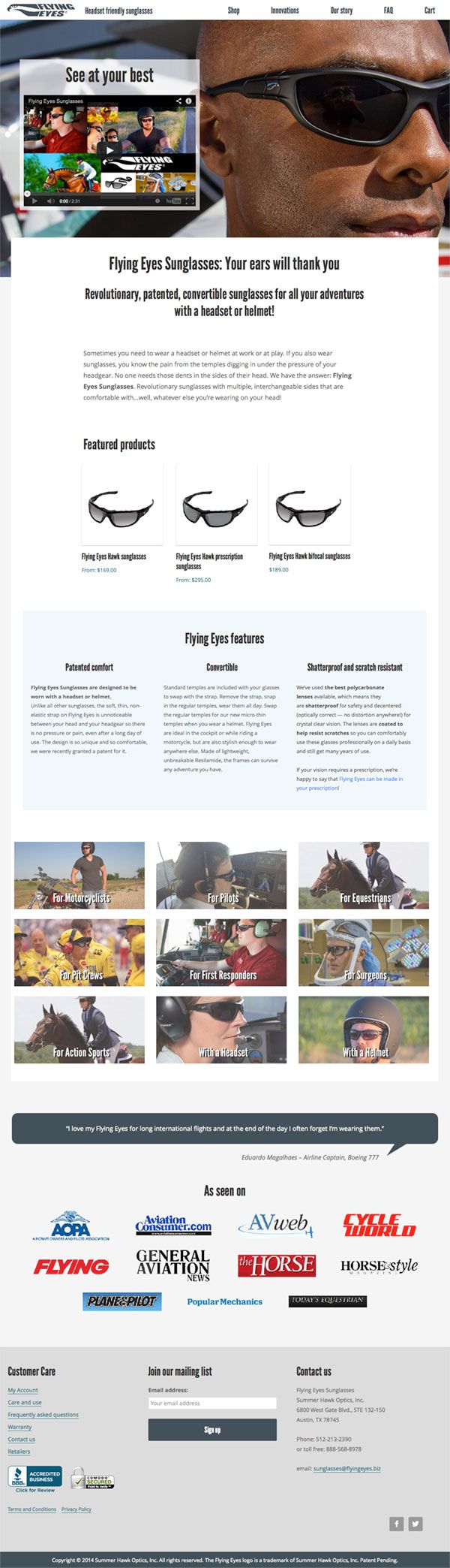
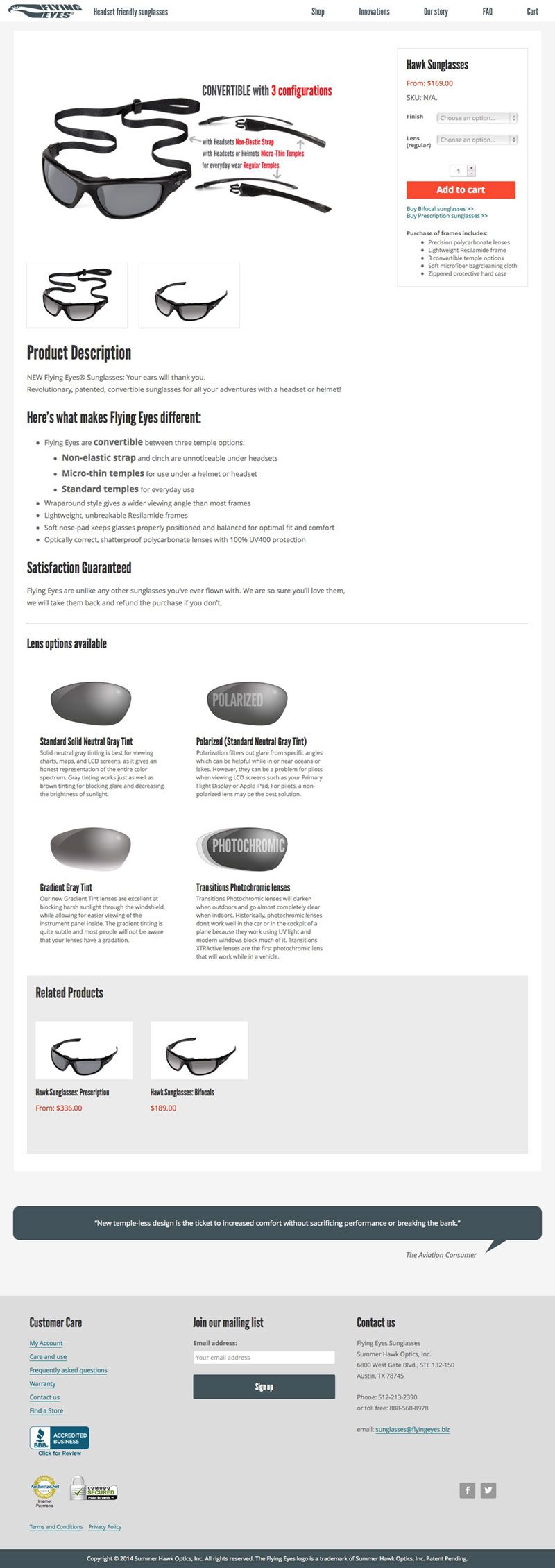
Final design
Results
Since the launch of the redesign, average monthly sales have increased by 45%.