Why So Serious? Redux website
- Ethnographic research
- Personas
- Content strategy
- Information architecture
- Wireframes
- Visual system
- HTML/CSS, jQuery
- Hardcore Google-fu

Introduction
Why So Serious? was an alternate reality game produced by 42 Entertainment to promote the 2008 Warner Bros. film The Dark Knight.
Players uncovered separate story points from online puzzles and real-life scavenger hunts that as a whole, served as the prologue to the film. It is arguably the largest alternate reality game ever produced, spanning 1.5 years, 4 concurrent plots, 10 offline mass exercises, and 40 websites.
As one of the most involved players, I noted the lack of information about the entire campaign. I aimed to relive my experience with the game and provide other players a way to relive their experiences too.
What I did
User research
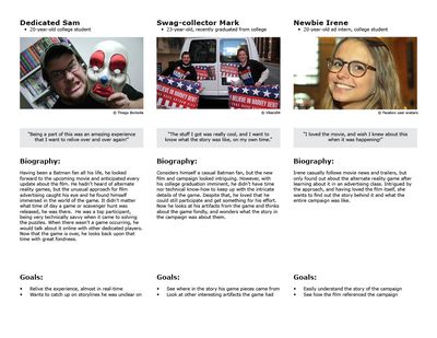
Being a regular on the online forums where the game was most frequently discussed, I witnessed several types of players. I combined characteristics of those players into individual personas.
Content strategy
To engage the most dedicated players, I designed the archive as if it was an internal investigation by the Gotham Police Department Major Crimes Unit.
This concept was extended by having the archive acquired by the Joker and vandalized with in-game notes to send to his followers, i.e. the game players.
Content inventory
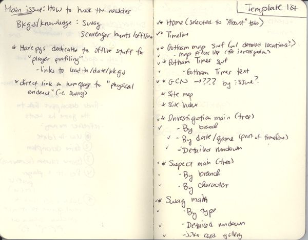
Being faced with what I later calculated to be 450 pieces of information, organizing all of it was one of my priorities.
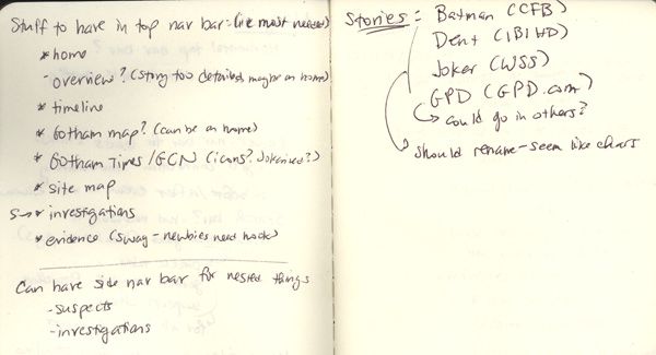
Site map
Once the inventory was done, I categorized all pages and internal links into an Excel spreadsheet. This came out to be almost 975 rows. The first screen is shown here.
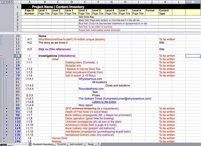
I also used the spreadsheet to track what pages I needed to write content for. Whether it was for this project or for the original game wiki (for which I was the top contributor), I had a hand in writing everything that wasn’t directly part of the game itself.
User experience
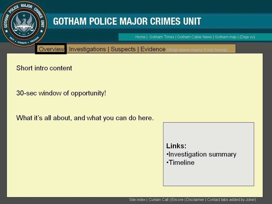
Acknowledging the differing content types across the site, I designed several high-level page templates in Powerpoint (seriously!).
Visual design
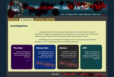
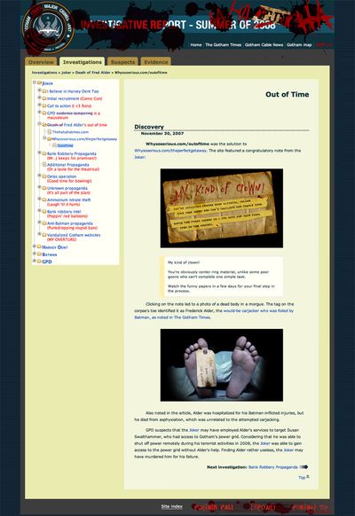
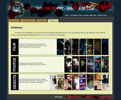
Since I aimed for the experience to be as in-game as possible, I chose to keep the same visual style as 42 Entertainment had used, especially for the Gotham Police Department storyline.
Due to the static nature of the website and the customization needed for almost every page, I hand-coded all 450+ pages myself (seriously, I lost track) using HTML and CSS, with jQuery for select interactions.
Final version
Results
The site can be found at WhySoSeriousRedux.com. Here are reactions from other game players:
“I squealed. thank you so much!”
—Quinzel
“Wow, cool! It’s VERY well done.”
—Lightning257
“Ho-Lee CRAP! This is epic!”
—boywondernerdDC
Along the way, I made friends with several game designers at 42 Entertainment who had produced the campaign itself. Here are their reactions:
“Holy cow that’s awesome! Amazing amount of work there.”
—Steve Peters, Experience Design Director, 42 Entertainment
“My mind is blown. This is amazing. You are a genius, Anita! Wow…You have an amazing eye for detail and accuracy – you are able to put the puzzle pieces of a real-time narrative back together again with elegance. You are able to consolidate and incorporate other peoples’ work into a cohesive whole with seemingly little effort.”
—Krystyn Wells, Experience Designer, 42 Entertainment

