
"Piece of Cake" PCR prototype
- User interviews
- Personas
- User flows
- Wireframes
- Usability testing
Introduction
Having worked in a cancer research lab for 7 years, I was well-acquainted with poorly designed interfaces!
Scientists often experience frustration instead of focusing on what’s truly important – data collection and analysis. One of the most common machines in any molecular biology lab is the polymerase chain reaction (PCR) machine, and one in our lab was particularly frustrating to use. I aimed to redesign it to be more intuitive and user-friendly.
My motto for this project: “Get results. Save the world.”
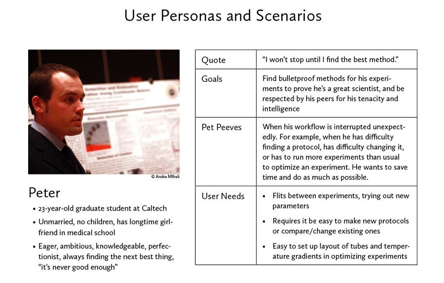
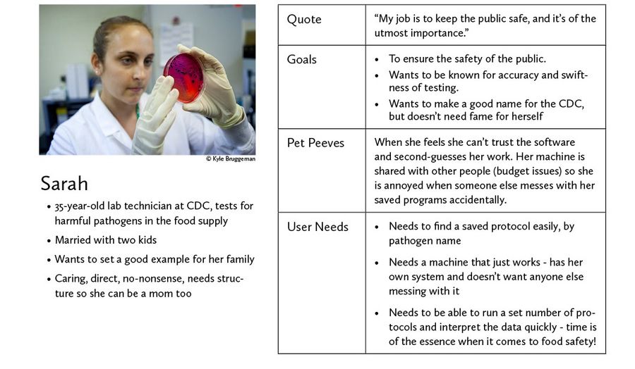
User research and personas
In this case, the designer was also the user, but to get other perspectives, I interviewed several scientist friends and colleagues.
Across the board, they said they weren’t comfortable using the PCR machines in their labs. One said:
“Usually it seems like something that should just magically work. Sometimes it doesn’t, though, so I get nervous about just putting my tube in there and waiting three hours.”
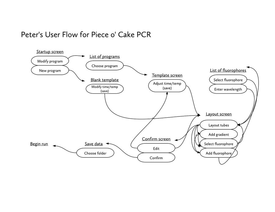
After the interviews, I developed two scientist personas with different goals, and developed flows for each of them. In each case, I focused on clarity and reassurance.

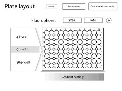
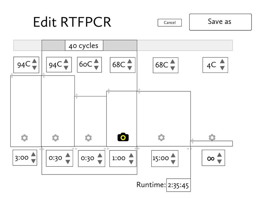
Wireframes
I designed wireframes in Adobe Fireworks to combine the needs of both personas.
Keeping in mind that each PCR run was worth time and money, I particularly emphasized the use of confirmation screens and final checks to ease the mind of a frazzled scientist. The UI also features large buttons, to keep the touchscreen easy to use with gloves on.

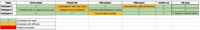
User testing
I asked three additional colleagues to go through an Invision prototype of the project. I asked how they would use the program to go about their PCR business, and observed their reactions and difficulties.
I realized I missed a few confirmation screens along the way, and several had trouble understanding the scope of several screens.
Final version
Using the findings from the usability tests, I am currently making additional changes to the wireframes. Nonetheless, all the test participants found the overall layout and confirmations to be a great improvement from the current interface.