World IA Day SF 2019 notes
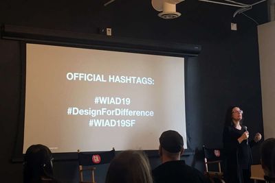
Gendered AI with Chris Noessel
Original thread on Twitter
Chris Noessel is up to talk about gendered AI. You notice how AI in movies are often male? What ramifications does that have? “What stories aren’t we telling ourselves about AI?”
He started building a database, and here are the findings. In pie chart form!
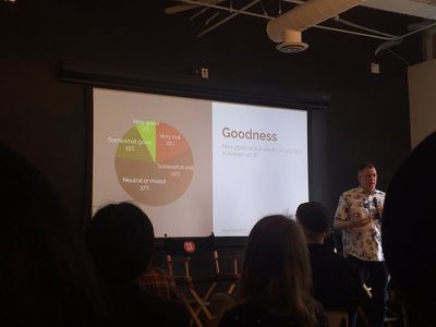
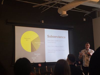
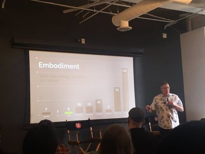
Most are neutral, free-willed, and humanoid, with general intelligence. Gender is mostly not important to the story, but still mostly male.
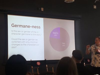
Male AI is machine, females are bodies. Males are extreme (overly good or evil), females are neutral. Male is default, female only when necessary (i.e. childbirth).
Representation matters, even in tech. Design wisely!
Designing for all socioeconomic backgrounds at Facebook (lightning talk)
Original thread on Twitter
Up next are lightning talks! -cracks knuckles- Angela Pham from Facebook Design talks about designing for all socioeconomic backgrounds. Most corporations are run by ppl with privilege. What are our users’ circumstances?
Tip 1: Reflect reality even in your mockups and PR
If ppl can’t relate to what they see, they won’t relate to your product.
Tip 2: Debubble your work!
Go on embedded research trips. Angela traveled to India during monsoon season to see how they used Facebook.
Tip 3: Be simple, straightforward, and human
“Post a status update” became “What’s on your mind?” On Facebook in the US. But in India it’s “Write something here...(local language)
Tip 4: Embrace those “edge cases.”
Edge cases usually mean “people not like us.” Facebook uses “No Edge Case” cards to remind themselves to design for all.
Nico Herzetty later chimed in about the origin about “No Edge Case” cards and provided a spreadsheet link for the cards.
Tip 5: Hire from all socioeconomic backgrounds
Identify your biases and move away from them.
Diamond Ho (also from Facebook) came up to talk about language and conversations. Be sure to design your mockups for languages that may be very long compared to English. Also, hire people who are familiar with all sorts of languages.
User research on a global scale by Monica Guerrero
Original thread on Twitter
Next is Monica Guerrero to talk user research and designing in multiple countries. Become a blank slate to combat biases in research. Assume nothing, recognize your biases, and observe instead of judge.
Notice the differences in different cultures, such as writing systems and meanings of colors. The Uniqlo site is vastly different in the US, Germany, and Japan!
Test your designs. Reach out to people and connect, in order to reach an international audience.
Accessibility at the Senior Center Computer Lab with Cordelia McGee-Tubb
Original thread on Twitter
Next is Cordelia McGee-Tubb to talk UX Lessons Learned in the Senior Center Computer Lab! A lot of our tech is created by young able-bodied ppl, and thus for them.
7% of older adults are going online, and Cordelia thinks it’s low—it will rise! 42% of older adults use smartphones in 2017, up from 18% just 4 years before.
Feasibility is table stakes for for older adults - are older adults able to physically perform the thing? Make your buttons big and spread them out. Consider your active boundaries.
Double-clicking is very hard, and Cordelia wants to do away with it!
Older adults often share computers, and want to log out of your thing! Why are we making it so hard to do that?
Make sure older adults know what you mean when you use certain icons. Use labels, tool tips, and never use the same icon twice! (And do usability testing!)
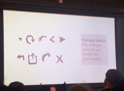
Many older adults write documentation for themselves to traverse a website - if you change something you think is minor, you may confuse them! Be obvious how to get out of things Iike modals.
Design for Difference panel
Original thread on Twitter
Having “empathy” for one group can mean you forget the needs of another group. That’s why it’s so important to hire a diverse workforce. Plus nobody ever fits the “average,” in fighter jets or in tech products!
Designing for Difference means examining who is designing the products as well. Groups of straight white men designing diversity tools means they’ll miss stuff because they haven’t lived it.
Empathy shouldn’t be one-way. It’s always a process, and you’ll never be 100% there. That’s why we do user research!
When channeling empathy, come from a place of humility and knowing you aren’t the expert.
Designing for Difference means aligning expectations and goals of the team, to ship a product or service that can make a difference for people.
Aiming for 80/20 helps make Designing for Difference possible. It will never be 100% but you can still make an impact. (This is how I rationalize designing for government - whatever I create will be 1000% better than what currently exists!)
Es Braziel says we don’t design in a vacuum, we are all part of a system. We become a collective to Designing for Difference and help each other have an impact. By including everyone in your user research, you can find use cases that can help everyone.
Designing for Difference means keeping your stakeholders accountable and sticking to your morals and values.
Designing for Difference also means walking the walk. Your org can mentor women in tech, if they say they believe in supporting women in tech. “There’s a glass ceiling, but also a sticky floor.”
Es Braziel negotiated with Microsoft to ask for 2 things, so if Microsoft said no to 1 they’d still get 1. (Good negotiating trick!) Mo’ money and a gender-neutral bathroom. They’re building the bathroom now woohoo!
Businesses often calculate and make ethical decisions due to finances, but Designing for Difference means going after “good money” instead of “bad money.” You might find a creative ethical solution under financial constraints too.
Designing for Difference means being strategic about the positive difference you want to see at your org and how to get there.
To Design for Difference, it’s important to start with a minimum bar, such as accessibility principles. You have to start somewhere.
Es Braziel says when you design, you always exclude since you’ll never be able to talk to or test your product/service with literally everyone. The best you can do to Design for Difference is be aware of it and be intentional with your research.
Ageism is such a thing in SF! Someone in their mid-30s can be the oldest person in their startup, period. Designing for Difference means knowing that the overachieving culture isn’t the only way that work can work. “Designing for age means designing for your future self!”
Last thoughts about Designing for Difference—take 30 min to mentor a woman in tech!
User research in healthcare fireside chat
Original thread on Twitter
Last is Steve Portigal doing a fireside chat with Marianne Berkovich about doing user research (and being the first user researcher) at a healthcare co to Design for Difference.
Marianne says being the first user researcher means advocating the importance of users and user research, first and foremost. Designing for Difference is difficult when people in the C-suite are changing. You have to strategize and time things when they’re accepted.
She maximizes Designing for Difference by working as part of a team to advocate each other’s work, so it’s not about herself or one person pushing ideas along. We have to work together!
Learning will always be a part of user research. Marianne left Google because she wanted a different space to learn in. She started out as English major and didn’t want to go into tech bc that’s what her dad did (hah def familiar) but did technical writing. Then realized that if software was better designed, she wouldn’t need to write so much for it!
Back when Marianne first stated in UX, the best thing to do to learn it was get a master’s in HCI at CMU. But now she cultivates a practice of critique in research techniques. We can all learn from each other in real time!
Woohoo, Marianne is getting her org to move away from NPS! But how to ask useful satisfaction questions—another challenge!
Last thoughts from Marianne: A shoutout to Cordelia’s work volunteering at a senior center. Explaining to someone unfamiliar with all tech concepts (signin/login, where to put it??) is an eye-opener! “I’m sorry on behalf of everyone in the tech world!”
