Designing for Inclusion

Watch the event video on YouTube.
A crash course on DEI: How to create more intentional designers by Alexis Lucio
Original thread on Twitter
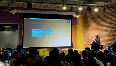
First up is Alexis Lucio from Splunk to give us a crash course!
How do we design for diversity and inclusion in an environment that’s not diverse or inclusive? Alexis says to treat the disease, not the symptoms. You have to lean into the discomfort and learn the differences between diversity, inclusion, and equity.
- Diversity: Getting invited to the dance
- Inclusion: Getting asked to dance
- Equity: Making sure your music is played, offering slide scale to the dance, free transportation to those in need
We also need to know the differences between privilege and oppression. Privilege is special right afforded to few. Oppression is when a group is seen as lesser over time.
Alexis says we should read Tatiana Mac’s work. And pay people to teach you about this—it’s a lot of work!
To test things out, try Google Lighthouse and WebAIM screen reader simulation.
Get educated about gender! Look at the “gender unicorn”. Also ask, does your product need to mention gender in the first place?
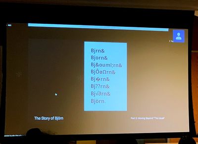
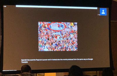
Translation is important! Google Translate was turning call-to-action buttons into shirt buttons for Alexis. 🤦🏻♀️ (Personal note: Google Translate was turning “San Francisco” to “New York” in Chinese for us whenever “the City” was used! 🤣)

Things you can do now to promote true diversity and inclusion in your design work: educate yourself, start small, translate the need (it’s not just about compliance), find allies, and breathe! This work is really hard!
Community-based approaches to building diversity by Jihern Baek
Original thread on Twitter
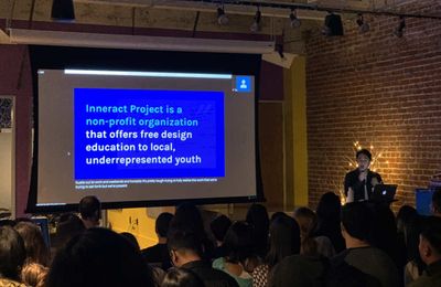
Up next is Jihern Baek from Thumbtack and Inneract Project to talk about community-based approaches to building diversity!

Design these programs for students. That way you think of the big picture and bring people along with you.
Empower students to drive their own learning. That drives true motivation. You also have to design in context. Invest long term and unconditionally. You have to reinforce the learnings. Get them outside support too.
What we can do: have convos at work, partner with nonprofits and local orgs, offer external mentorship!
How an inclusive design framework leads to adaptive experiences by Shabi Kashani
Original thread on Twitter
Next is Shabi Kashani from Google sharing her framework around disabilities that promote an adaptive experience. We switched tasks every 3 minutes and switch devices 20 times an hour! Everyone’s behavior resembles ADD.
We are all disabled for learning in some way. Driving is situational, exhaustion is temporary, and ADD is permanent. Disability is a mismatch between one’s ability and their environment. “It’s not the user’s fault!”
Spotify's “car view” adapts a typical mobile interface to focus on necessities (bigger fonts) and strips away things users don’t need.
Shabi’s framework: prioritize users with disabilities. Add alt text only when image is useful. People don’t need to know it’s an image of a fluffy cat if they’re trying to do something.
Pay attention to how headings are nested, and make sure they displayed. It’s how screenreader users navigate through a page.
Design for keyboard accessibility. You can use a screen reader, switch devices, and use a Braille keyboard too! But make sure you prioritize the tasks so keyboard users don’t have to tap a ton to get stuff done!
Think in systems. Be aware of the contexts that people are using your products. People with disabilities often don’t have a choice in what devices they can use.
How to fight ableism in your work: prioritize user needs, accept all inputs and outputs, think in systems.
Inclusivity is not a checkbox by Aiden Zucker
Original thread on Twitter
We finally learn what Remind does! It helps teachers communicate with their students. Equity is a big goal of theirs—how is your product uniquely position to address inequity? For instance, we can’t assume every student has a smartphone. 19% of US does not!
Remind isn’t just a smartphone app, it sends text messages. It costs money to send texts, but worth it to make sure all students have the same opportunities.
We assume every students in the US speaks English at home, but 78% do. Remind would miss out on parent engagement that way. Critical for student success!

Remind did video calls with teachers all across the US to hear how they used translations. Google Translate isn’t all bad, but sometimes it can Be Bad. (“Traffic collision” turned into “dismembered head” in Russian!)
By letting their user set their preferred language, Remind helped empower teachers to send messages right to their target audience. Remind also hires professional translators to help! They’re always looking to get better.
How to make sure inclusivity is not a checkbox. Answer these questions: What is your product trying to achieve? Who are you designing for? What is your product uniquely positioned to address? Consider the nature of your product, talk to extreme users.
Panel with speakers
To evangelize for accessibility, Alexis says to talk about future tech debt, work with product managers on timelines. Shabi suggests talking about your users.
And don’t forget that you can get sued now for having inaccessible websites! Persis Howe (personal note: my boss at SF Digital Services) asks if we will ever cross the line from inequity to discrimination.
