An Event Apart SF 2022

A post-conference reflection
When Eric Meyer emailed me one day out of the blue, asking if I was interested in speaking at An Event Apart, I couldn’t believe my eyes. When I was just getting started in UX, I knew I’d get the most illuminating (and current!) tips about design and web development from any An Event Apart conferences. And you’d know when one was happening because design Twitter would just explode with enlightening gems.
Being asked to speak at one was beyond my wildest dreams. But alas, the talk deadline would literally be a month after my first baby was due, so I put on my leadership pants and asked to be put on the speaker list for a future event. (After Baby was old enough to be vaccinated for COVID, specifically.)
I ended up presenting on the mainstage (!!!) on what ended up being the very last An Event Apart conference. Although I’m sad that there won’t be another such gathering, I feel so grateful and honored to be one of the speakers sending it off.
Here are the notes that I took, the last live-tweets that I ever did on Twitter. (RIP Twitter...)
Declarative Design by Jeremy Keith
Two kinds of music composition: Mozart writing every note down, then there’s Miles Davis doing improv.
Same thing in programming too—imperative programming gives the computer step by steps. Then there’s declarative programming (like SQL), where you tell the computer the result you want.
Tim Berners-Lee created the World Wide Web with the “principle of least power”—use the most efficient way to parse information. Both HTML and CSS are declarative, fault-tolerant languages. They ignore what they don’t understand.
CSS is thought of as declarative, but it’s actually more suggestive. It’s more of a conversation between the end users, browser, and the author.
There’s also JavaScript, which is an imperative language. It’s more powerful, but it’s more fragile. If it doesn’t understand a direction, it throws an error.
You can use imperative and declarative languages together—use declarative approach first, then use imperative to be more specific. Ex: inputs. Defaults to text field, but you can specify email, telephone, etc.
Using a simpler solution lower in the tech stack means the solution is more robust. “JS should only do what only JS can do.” Don’t write dozens of lines of code when you can use <button/>! But many programmers want the kind of control imperative langs give.
Imperative mindset = working off of a lot of assumptions. Using a declarative mindset gets you thinking about what the browser might be doing by default and adjusting. (Ex: padding-left = the start of a line assumes your user will be reading left to right.)
Let the browser do calculations. “Be the browser’s mentor, not its micromanager” according to buildexcellentwebsit.es
We even have imperative and declarative approaches to management! Imperative management = micromanaging, declarative management = trust to get to an outcome. It depends on the culture.
Jeremy says that design systems make clear the culture. It’s “the way we do things around here.” You can take an imperative and declarative approaches to design systems too.
You can have imperative and declarative thinking. Analytical thinking is imperative = v. exact, great for zooming in, not great for people. Systems thinking is declarative thinking = about relationships. Design systems are often imperative, thus fragile.
Instead of using hex codes to define colors, how about using relationships? Ex: the fill should be 10% lighter than the border. You can use CSS to get the browser to calculate that.
Remember that the tools we use start to change the way we work. The way we design right now (including Figma prototyping) is VERY imperative. Jeremy quotes Dan Mall: “Let’s not design in the browser, let’s decide in the browser.” It always depends! The imperative approach works for print and native apps, but doesn’t work so well for the web. We’re trying to control something we can’t actually control. “Fighting for control on the web is a losing battle.”
My AEA SF talk about working collaboratively during COVID

Read the transcript, although the super TL;DR takeaways:
- Other people are not obstacles to getting your work done. People are how the work gets done. 👨👩👧👦
- If your org was committed to success, they will give you the means to succeed. 💪

How to Win at ARIA and Influence Web Accessibility by Tolu Adegbite
The point of ARIA is to indicate to assistive technologies about what’s visually happening on a component.
It’s important for UX designers to understand how ARIA works, because it’s how nonsighted users will experience the web. Otherwise you delegate that decision-making entirely to devs.
Tolu recommends doubling up in code when using native HTML landmarks, since assistive tech reads them out inconsistently. So even if you’re using <nav> it’s a good idea to also use <role=“navigation”> to make sure all your bases are covered!
Overdoing ARIA attributes can make the experience worse than not using ARIA at all. “A role is a promise.”
If you don’t understand how an ARIA attribute works, it’s better not to use it. Always prioritize native HTML tags. Do not change native semantics unless you really have to. Make sure interactive ARIA controls are visible and usable with a keyboard.
It’s been a long time since I’ve had to implement ARIA attributes myself, but it’s super cool that there’s ways to indicate context to nonsighted users, like “complementary” landmarks for related content!
The attribute aria-describedby can be useful in a password text field to connect it to its help text, so the help text is read when they land on the password field instead of having to tab over. That’s part of the user’s experience!
Navigating challenges in your (fill in the blank) career by Fonz Morris
- Have patience and resilience. Fonz had to go outside his comfort zone seeking resources to bolster his computer science education. But it was a journey, including a uni transfer.
- Have a strategy. Don’t just react, have a plan. And remember to learn EQ, not just hitting the books (IQ). It depends on the situation, sometimes you’ll need to learn more IQ too.
- Decide your impact level. This depends on what you CAN do, and where you are in your career. Doing everything as an entrepreneur worked for Fonz when he was young, but then he went back to corporate and had to learn about promotion levels. He missed out on 2 promotion cycles despite doing everything he was supposed to, then went to his head of design with the goal of getting clarity. Turns out the internal system wasn’t working well for him, and perhaps for others there. It’s not just about you.
- Mentorship. Mentors provide clarity and support when you need it. Career progression is a lot messier than just a ladder! ADPlist, Rethink, dev color, Mentorpass, General Assembly, LinkedIn.
Q&A
Fonz thinks bootcamps CAN be a good equalizer—you don’t need to graduate from certain unis to learn. But you still need real world experience. And some of those bootcamps are prohibitively expensive!
Fonz says to treat burnout, take a break! And ask yourself what you’re burnt out about. The solution depends on if you’re burnt out from your job, your company, or your industry. Find what gives you a spark (anything!) and pursue that.
Re: short tenures at companies, Fonz says it’s important to treat yourself as the stakeholder of your own growth and career. (Just like companies are beholden to their stakeholders!) Be truthful when a company isn’t working for you.
Multilingual design for the web (and beyond) by Preston So
Multilingual web design isn’t just adding a language selector or a Google Translate widget. It’s about understanding the languages our users use and how they work.
More CSS properties to help meet our users where they are, no matter what language they’re using:
dirwriting-modelang(even mixed with another languages)text-orientationtext-combine-upright
Remember to use HTML first to set the default reading direction, don’t just use CSS to do whatever you want. Set the structure first.
Markup that I never knew about, to help give readers of logographic languages more context about a character they might not know about: ruby and rb
Also, the CSS prop text-emphasis can customize text styles you want to bold, but bold wouldn’t look great. (Ex: putting a red dot next to Chinese characters.)
Preston encourages us to think more logically in our web layouts, not physical. That gives us more flexibility when it comes to languages. Be agnostic to writing mode, not specific. Try stuff like margin-block-start instead of margin-top.
| Physical properties (Specific to writing mode) | Logical properties (Agnostic to writing mode) |
|---|---|
| border-left | border-inline-start (horizontal-tb, LTR) |
| margin-right | margin-inline-end |
| padding-top | padding-block-start |
| clear: left; | clear: start; |
| float: right; | float: inline-end; |
| text-align: left; | text-align: inline-start; |
There’s even markup to indicate how spoken language should be read on platforms like Siri. Not much for signed languages yet, but Preston is excited to see what comes up next.
Takeaways:
- Understand your users’ languages deeply and treat them all as first-class citizens
- Use lang attributes
- Pay attention to lines of text (breaks, wrap, hyphenations)
- Respect directions the text can go
And think bigger beyond the web!
Transform your Meetings into Hybrid Workshops by Erin Casali
Remote collaboration should not actually default to calls or meetings. Think about if they’re sync/async or in-person/virtual, but they can be combined too.
You want to leverage the benefits of each approach—it’s not about not meeting anyone ever. Async can make it possible for the less boisterous people to contribute too. Ask what the outcome of this call should be.
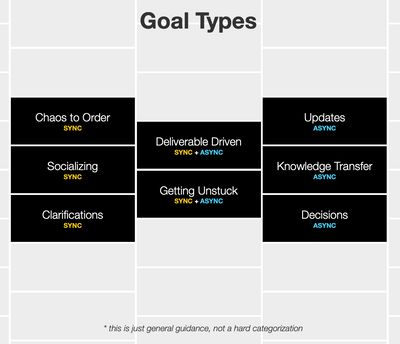
Sync is best when you need:
- To get order out of chaos
- Socialization
- Get clarity when things are confusing!
When you want the a deliverable, or to get unstuck, use sync+async approach. Use all the approaches to get the best ideas.
Updates, knowledge transfer, and decision-making should be async. People need time to absorb that kind of info.
“Remote-first” doesn’t necessarily mean 100% remote, it’s just that everyone is equal. You need a set of rules that apply to everyone, a set of process that works for everyone.
You can run workshops in serial or parallel. Serials means one process in order, with same ppl. Parallel means you combine results from virtual and in-person workshops. Erin does not advise running a virtual+in-person workshop at once. Try remote first, then hybrid.
The most important thing when running workshops is to avoid creating 2 tiers of people. Remote is inherently inclusive.
To get the best ideas, people should ideate on their own first (async), then bring the group together to brainstorm (sync). It’s not just about reading in advance, but give people a useful activity to do on their own.
During the workshop process, the only part that needs to be sync is the convergence of ideas. Everything else can be async!
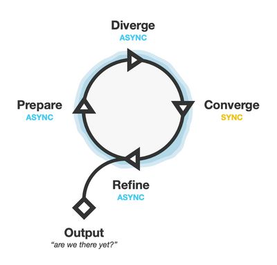
This kind of hybrid workshop doesn’t necessarily take more time. Planning a workshop would take time, no matter what format. But async means you can wait longer for people to give their input.
Patterns to use in workshops
Async
- Prepare the board: pre-fill it with existing data so everything is ready to discuss.
- Use individual boards: Provide a separate board to everyone, decide if same or separate spaces.
- Use individual stickies: Everyone works on same board but provide individually-labelled stickies.
You can give workshop participants their own board if they really need to think about something. But if they’re sharing what they already know, having everyone together on the same board (with their own stickies) works well.
Sync
- Dot voting: Get people’s consensus on something. It’s effective when you need to steer conversation to the work itself instead of a random tangent.
- Silent sorting. Give 10 min for people to sort ideas without talking. It focuses more on the work instead of having to say something about it.
- Breakout rooms: You can also use breakout rooms to get people discussing a particular thing, but in a more controlled way.
Pro-tip: plan but be flexible
Flex time or flex agenda. Plan activities, but be open to letting people continue to work together if they’re really in a flow. (Or skip an activity if it becomes clear it won’t be effective.)
For hybrid workshops, it’s important to have everyone focus on something, whether it’s a whiteboard or a live doc. That way, it’s easy to orient yourself about what to work off of.
Changing the culture around workshops
“Change is hard! Inertia usually wins.” Start small with these new hybrid workshops, run experiments, then review its effectiveness and success.
Retros for your experiments can nurture motivation. Then you can ID champions for your change and support your champions when they run their own experiments!
In a call-centric culture, having time to do activities can be hard. People are always scheduled for calls! You can block people’s time to devote to doing an activity instead. (But ask them first, if needed!)
Every workshop has (or needs) structure. Highly-aligned teams often seem like they don’t need structure, but that’s because structure is already inherent in the team!
If you have a high-level stakeholder who LOVES long, unstructured meetings, you have to find out what their fear is, and then determine how to mitigate that. Everyone has their own reason for wanting unstructured meetings.
Designing Better Onboarding with Krystal Higgins
How do you balance understanding with “engagement” and features and prompts?
If we act on our fear (that our users will miss something!) then it can lead to unhelpful solutions! If you front-load instructions, they’re hard to remember, out of context, and have questionable value.
And framing is important. If you give people ALL the instructions up front, it can give the impression that a task must be super hard! Plus they’re costly to maintain.
Better onboarding is about guided interaction, not front-loaded instructions. It means:
- Anchoring info to action in context
- Onboarding users at their own pace
- Integrating guidance authentically instead of tacking it on
Guided interactions can mean putting call to actions in context, when your user can truly understand what they can get. Ex: Canva encouraging signups only after a new user has made and saved a graphic, so they can edit later.
Consider how you’re measuring onboarding success. Less signups and clickthrus, more retention and engagement.
| Less these | More these |
|---|---|
| Sign up rate | Better short/mid-tern retention |
| Clickthrough rate | Deeper feature engagement |
| Tutorial/setup completion rate | Adoption in new markets |
| Memorizing features in study | Higher revenue |
Onboarding ends when core use begins, when a user sustains their needs while contributing to the product. You’ll need to figure out what actions define “core use,” then create a user journey with actions. Determine the prompt for an action, what work they’re doing, and what sort of follow-up they need. Think about what guidance the user might need at each stage.
When you create guided interactions in context, this gives users way more flexibility in how they use your product! And remember that a better onboarding experience comes from a good product design. It’s not just something tacked on that fixes everything.
Remember the basic of good product design before you consider extra fancy UI patterns: concepts, content, navigation, affordances, tutorials.
Beware onboarding overlays. If they interrupt a task, 90% of users will just ignore them! Plus overlays are likely to collide with each other since they’re designed in isolation. (Not to mention a mess for screenreaders!)
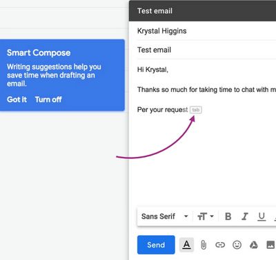
Guided interactions can also help users of all levels. Brand new Notion users are shown a particular blank page template, with prompts.
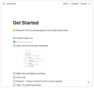
But even experienced users never encounter a wholly blank page. The default new page looks different depending on user needs.
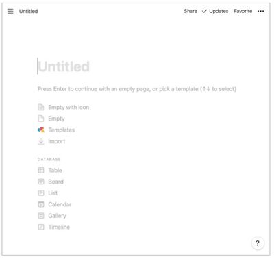
To get your team on board with better onboarding (harhar), define core use and break down any action they care about right now. Can try reducing overlays or front-loaded instructions, or improving an empty state.
Also try new user perspectives! Get your team using private browsing modes for a bit. Journal new experiences, and include new users in research plans.
We also need to get out of the “user education” mindset. We frame ourselves as the experts, and whyyy are new users not getting what we designed?? But we have to build products that adapt to our users!
Remember to build in ways to recover from errors. You cannot stop people from running into problems, but you can make easy ways to undo or recover from it.
What if People Weren’t the Product? Building a web that loves humanity by David Dylan Thomas
(Yes, we gave each other high fives at the speaker dinner about having talks about becoming person-oriented!)
Back in the truly olden days, we didn’t have mirrors. To see ourselves, we needed to find a still body of water. Instead, we looked at each other.
With the advent of mirrors, we suddenly became aware of how we looked to other people. The results ranged from 1st person novels to standing armies. Now the web, where “we cannot get away from ourselves” with ad personalization. We see ourselves as a product.
It all culminates in the term “personal brand.” Dave asks if we all died a little inside when we first heard it. 😅 But as James Baldwin said, eventually the world isn’t the thing that oppresses us. We oppress ourselves.
We see ourselves as products, and other people>products are getting more hits! The comparison is killing us. How much time should a user spend engaging with your platform? (And what would your shareholders say?) “Seriously, fuck engagement.”
This is the scariest graph about engagement:
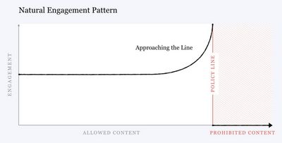
Mark Zuckerberg knew this. Facebook let content calling for the genocide of Rohingya in Myanmar stay online. They traded lives for engagement. Social media talk about fixing it, but the policies and incentives haven’t changed much. (Seriously, fuck engagement.)
There’s another way. The Siksika Nation (Blackfoot) have a concept of self-actualization that assumes everyone has already arrived, not anything you have to work for. The most wealthy are the most generous. You have nothing because you have given it all away.
Standup meetings actually display this Siksika thinking. A successful standup is when you unblock something for another.
Our current incentives are messed up! Capitalism encourages people to behave badly (to get more and more stuff), but puts in a ton of rules to try and stop people from doing immoral stuff, even if it goes against the system of capitalist rules!
What if we could consider our design process done when we have returned what we took back to the earth? (Designer Sadie Red Wing thinks about this stuff!)
The worst cognitive bias, according to Dave, is the “just world hypothesis.” With that bias, you believe bad things only happen to bad people. Everything that happens to you is your fault. It keeps us from thinking about systems (or having to fix them).
Our current system is also based a ton of assumptions. NYTimes in Europe switched from personalized to contextual advertising and actually increased their revenue! (DuckDuckGo uses only contextual advertising and is doing great!)
To get past the just world hypothesis, instead of asking yourself “Am I a good person?” ask yourself “Am I getting closer to my values?” (Also, therapy!)
Make a list of things your company or your stakeholders are willing to leave money on the table for. The shorter that list, the more unethical your company might be!
Can we practice interdependent design instead, where we prioritize connections to the people, the land, and our values? Can we design a web that reflects our values, where we live, and ppl we can help?
To do:
- ID your values.
- Start looking at how your work gets you closer or further away from those values.
- Co-imagine the future with the people hurt by the present.
Everything we fight were just ideas once. So what’s your idea? What’s our idea? What can we create together?
